Turning Localo's homepage into a stronger conversion channel
Turning Localo's homepage into a stronger conversion channel
Turning Localo's homepage into a stronger conversion channel
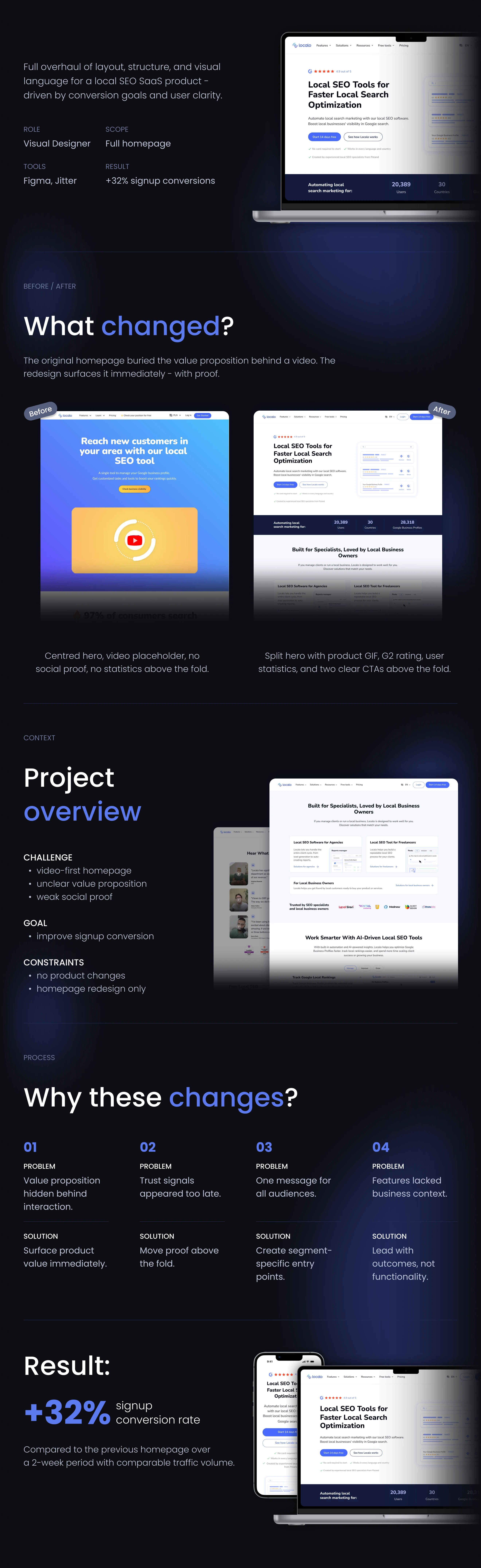
Redesigned Localo's homepage to communicate product value faster, surface trust signals earlier, and create a clearer path to signup. The new experience increased signup conversion by 32%.
Redesigned Localo's homepage to communicate product value faster, surface trust signals earlier, and create a clearer path to signup. The new experience increased signup conversion by 32%.
Redesigned Localo's homepage to communicate product value faster, surface trust signals earlier, and create a clearer path to signup. The new experience increased signup conversion by 32%.
MY ROLE
Visual Designer
Visual Designer
Visual Designer
SCOPE
Homepage Redesign
Homepage Redesign
Homepage Redesign
TOOLS
Figma,
Jitter
Figma, Jitter
Figma,
Jitter
OUTCOME
+32% signup conversion
+32% signup conversion
+32% signup conversion
Ready to collaborate?
Open to full-time roles and freelance projects. Drop me a line - I usually reply within 24 hours.
© 2026 Julia Kocot. All rights reserved.
Ready to collaborate?
Open to full-time roles and freelance projects. Drop me
a line - I usually reply within 24 hours.
© 2026 Julia Kocot. All rights reserved.
Ready to collaborate?
Open to full-time roles and freelance projects. Drop me
a line - I usually reply within 24 hours.
© 2026 Julia Kocot. All rights reserved.

Project overview
The previous version buried the core value proposition behind a video and required users to scroll before understanding what the product actually does.
Important trust signals and product benefits appeared below the fold, creating unnecessary friction for first-time visitors.
The goal was to improve clarity without changing the product itself.
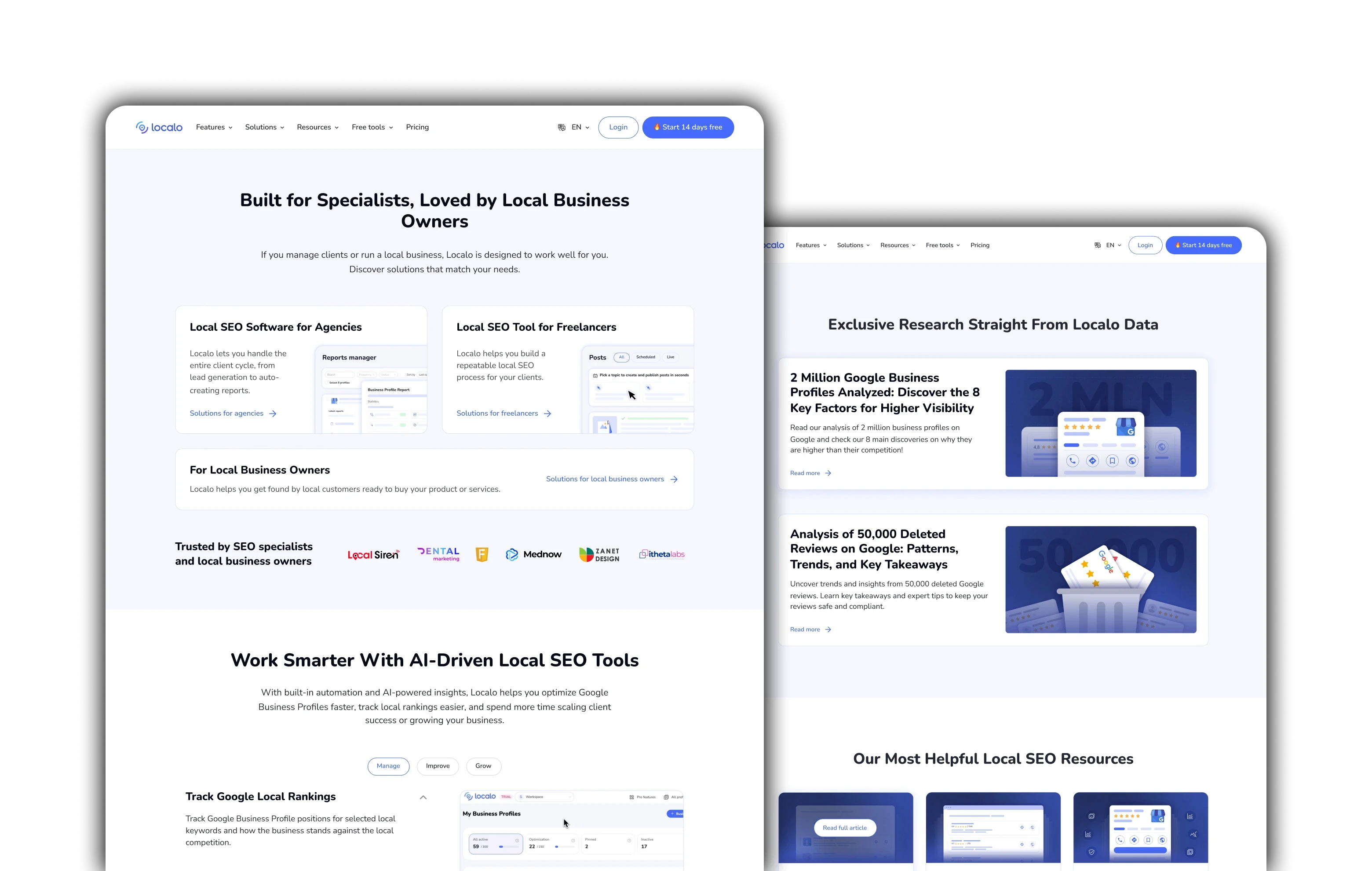
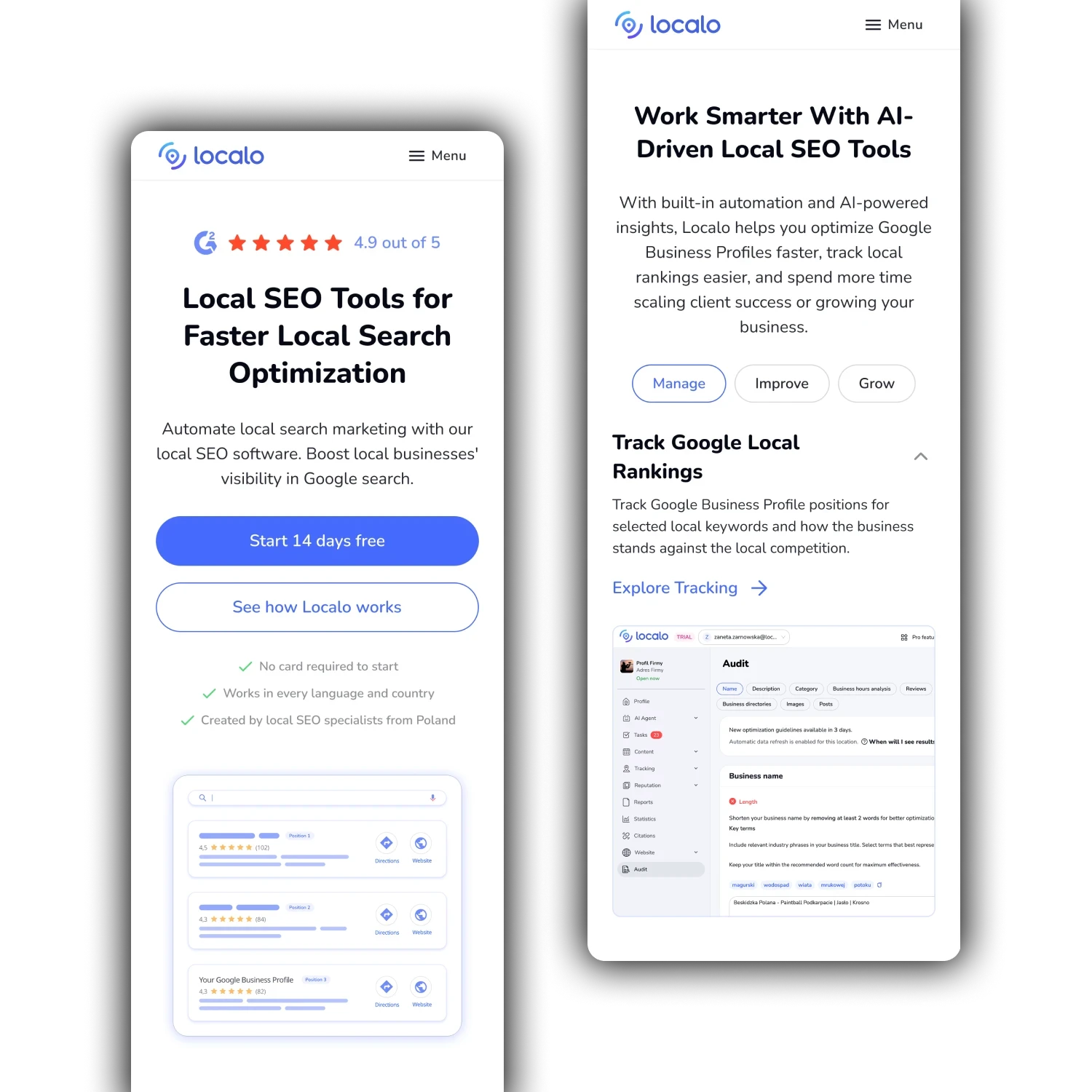
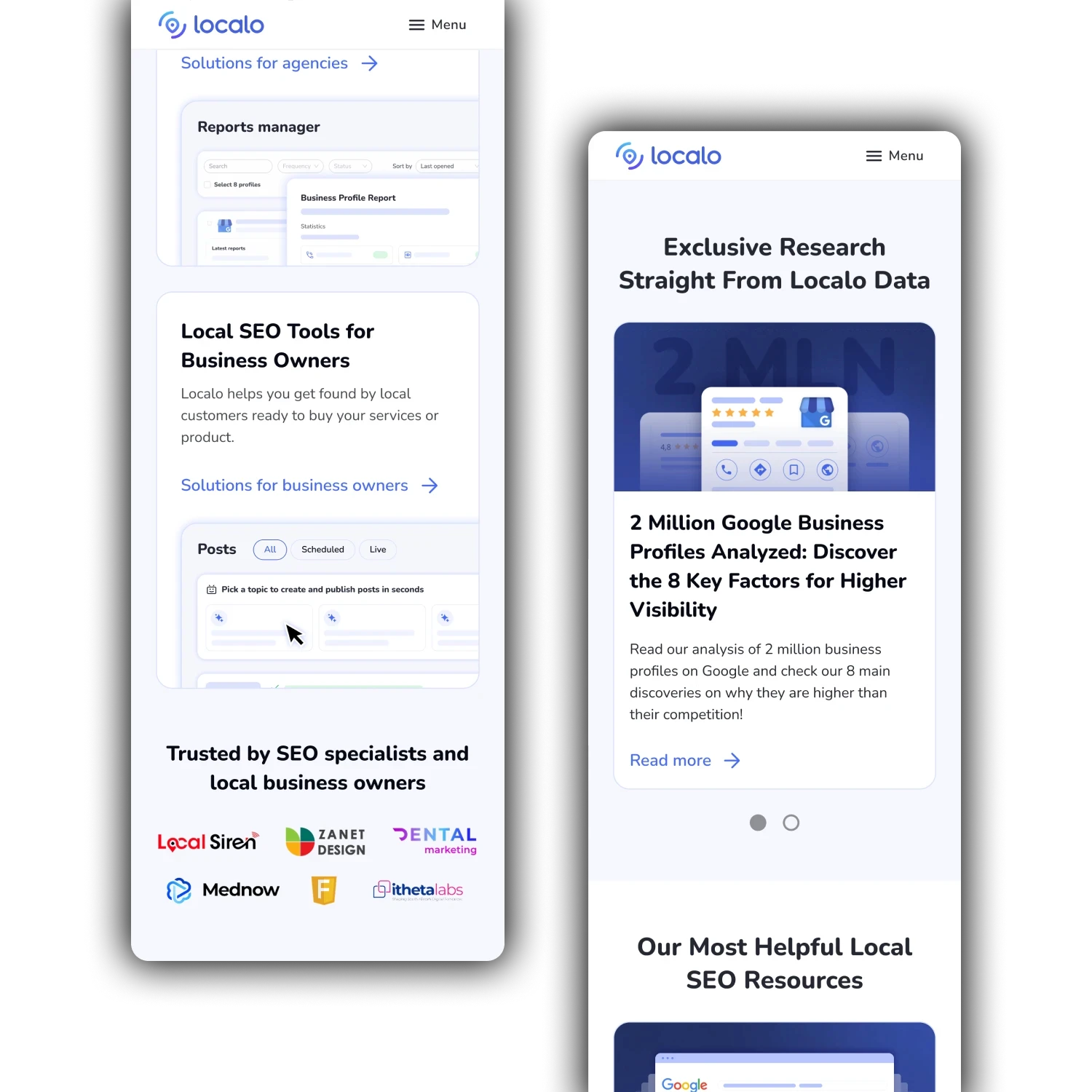
The updated homepage introduced:
• a split hero with product previews
• stronger trust signals above the fold
• clearer calls to action
• more outcome-driven messaging
• better content hierarchy
What changed?
The redesign focused on making the product easier to understand from the first screen. The new experience surfaced credibility earlier, simplified the messaging, and created clearer paths to signup.
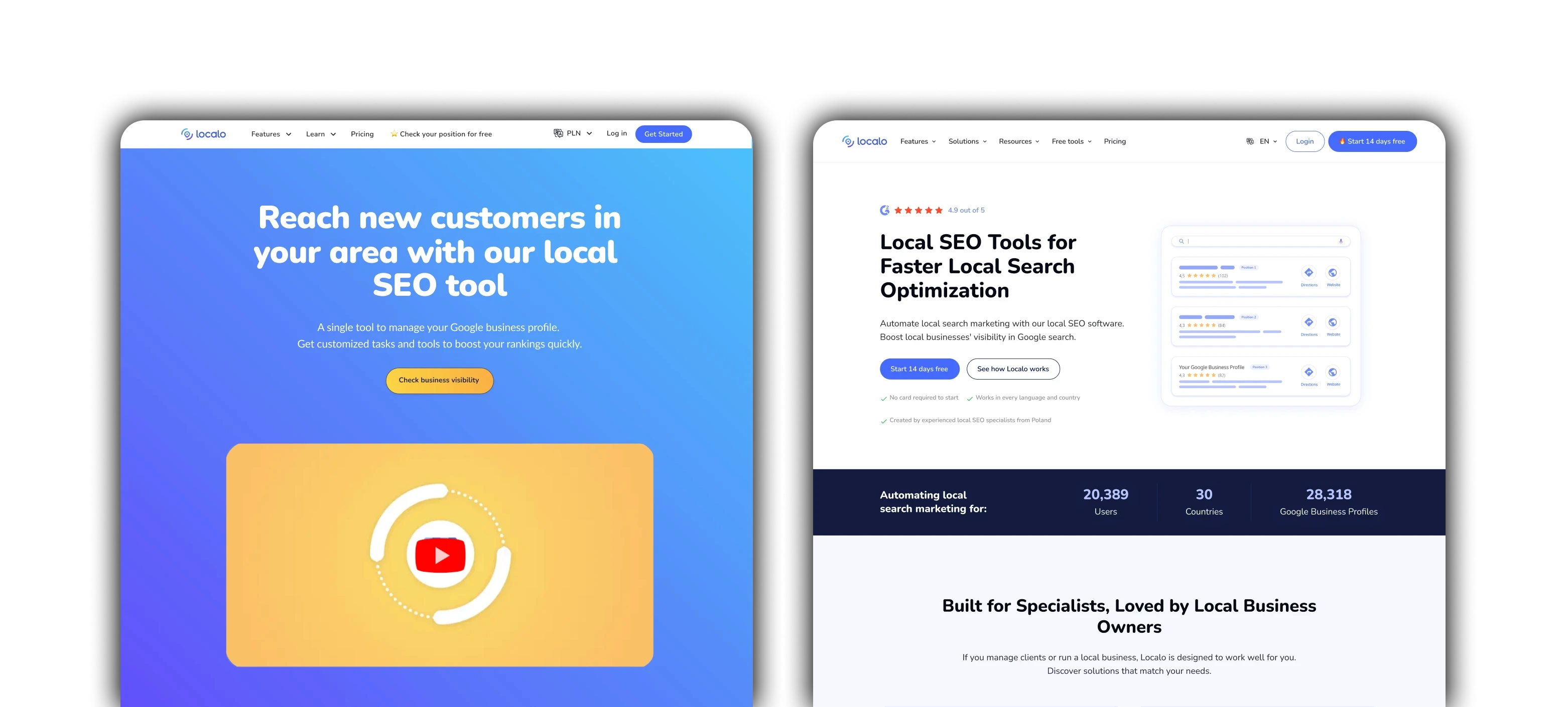
BEFORE
AFTER
BEFORE
AFTER
Features lacked business context
The experience focused on functionality instead of outcomes.
Trust signals appeared too late
Ratings, customer proof, and product credibility were hidden below the fold.
Unclear value proposition
The homepage required users to interact before understanding what the product actually does.
Messaging was too broad
Different audiences had different goals, but the homepage treated everyone the same.
Challenges
Design Decisions
Surface product value immediately
The hero section was redesigned to communicate what the product does without requiring interaction.
Simplify the message
Content hierarchy was reorganized to make the experience easier to scan and understand.
Build trust earlier
Ratings, social proof, and product credibility were moved above the fold.
Focus on outcomes
Messaging shifted from features to customer value and business impact.
Outcome: +32% signup conversion
Compared to the previous homepage, the redesigned experience increased signup conversion by 32% over a two-week period with comparable traffic volume.
The project demonstrated that improving clarity and trust can have a measurable impact without changing the product itself.