BodyVibes — Product & UX Improvements

Improving the BodyVibes experience, one flow at a time

Improving the user experience, one flow at a time

UX/UI improvements for the BodyVibes app, which lets users book sports and fitness classes with one subscription. Simpler flows, better existing features, and new ones.

COMPANY

BodyVibes

BodyVibes

ROLE

UX/UI Designer

UX/UI Designer

EXPERTISE

UX/UI · Product design

UX/UI ·
Product design

UX/UI · Product design

SCOPE

5 app flows

5 app flows

Pricing, redesigned to sell the experience

Problem: Each plan filled the whole screen, and many users didn’t realize they could swipe to see the others. Comparing plans was almost impossible.

The new paywall makes all plans easy to see and compare at a glance, and brings BodyVibes' visual language into the app for a more engaging B2C experience.
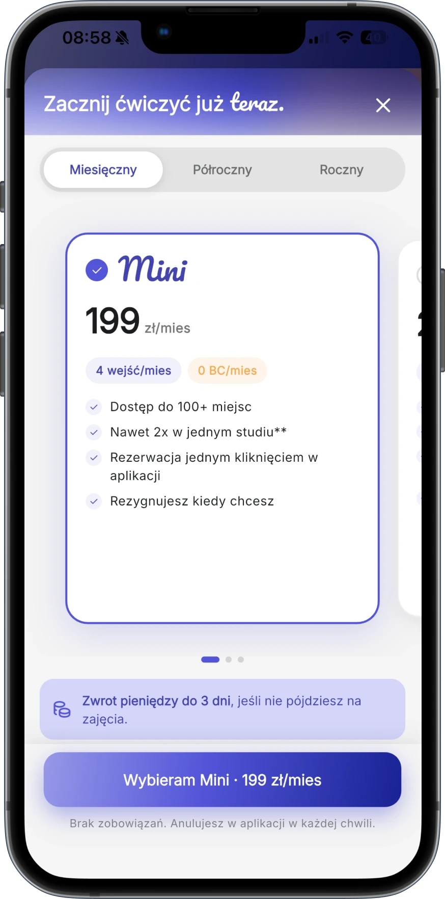
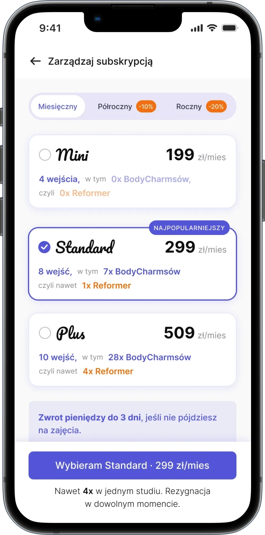
More value, less friction: clearer benefits, stronger promotions and an easier way to compare plans.

More value, less friction: clearer benefits, stronger promotions and an easier way to compare plans.

A smoother path from plan to payment

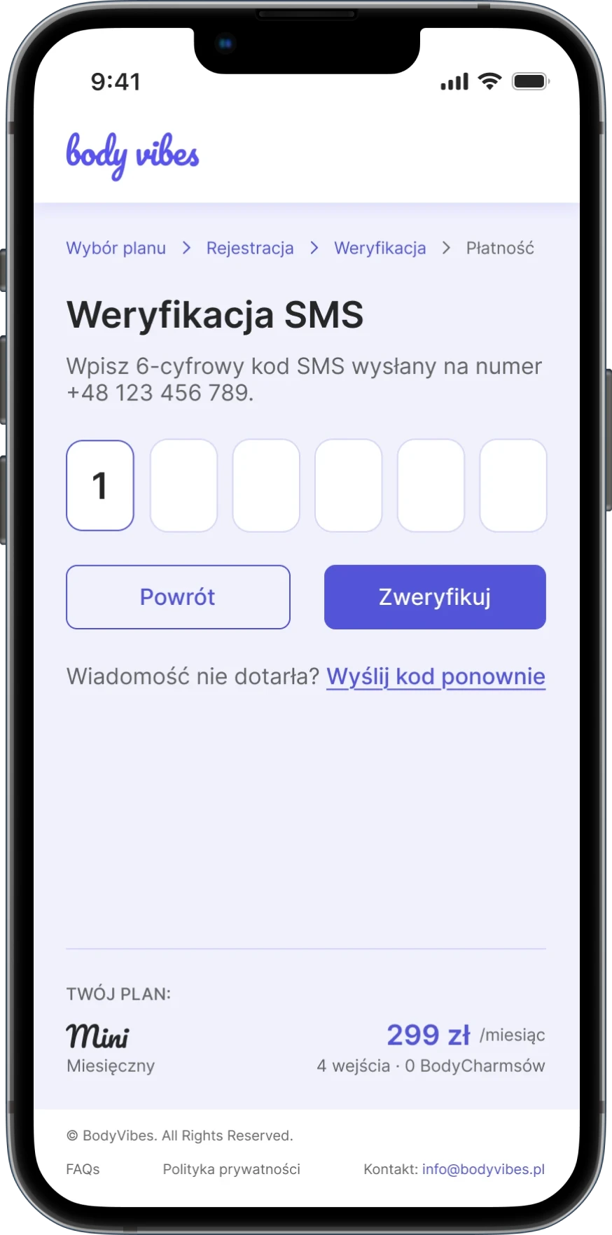
Problem: The old registration packed too much into each screen.

I split registration into focused steps with a clearer hierarchy, so every action is simple, from choosing a plan to verifying a phone number.
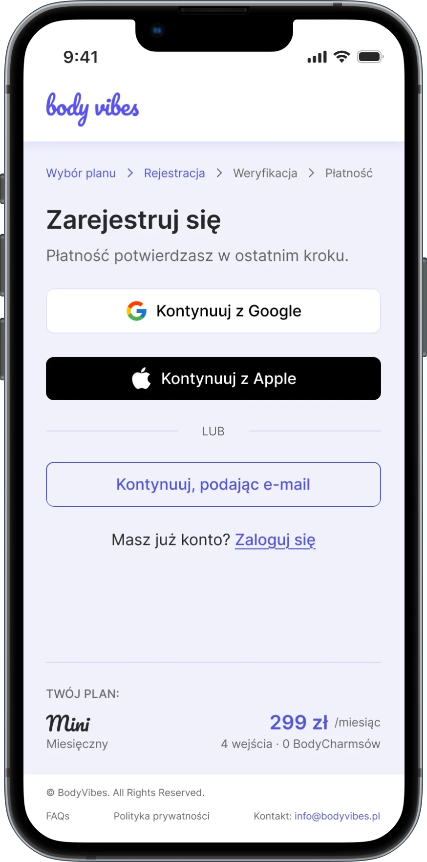
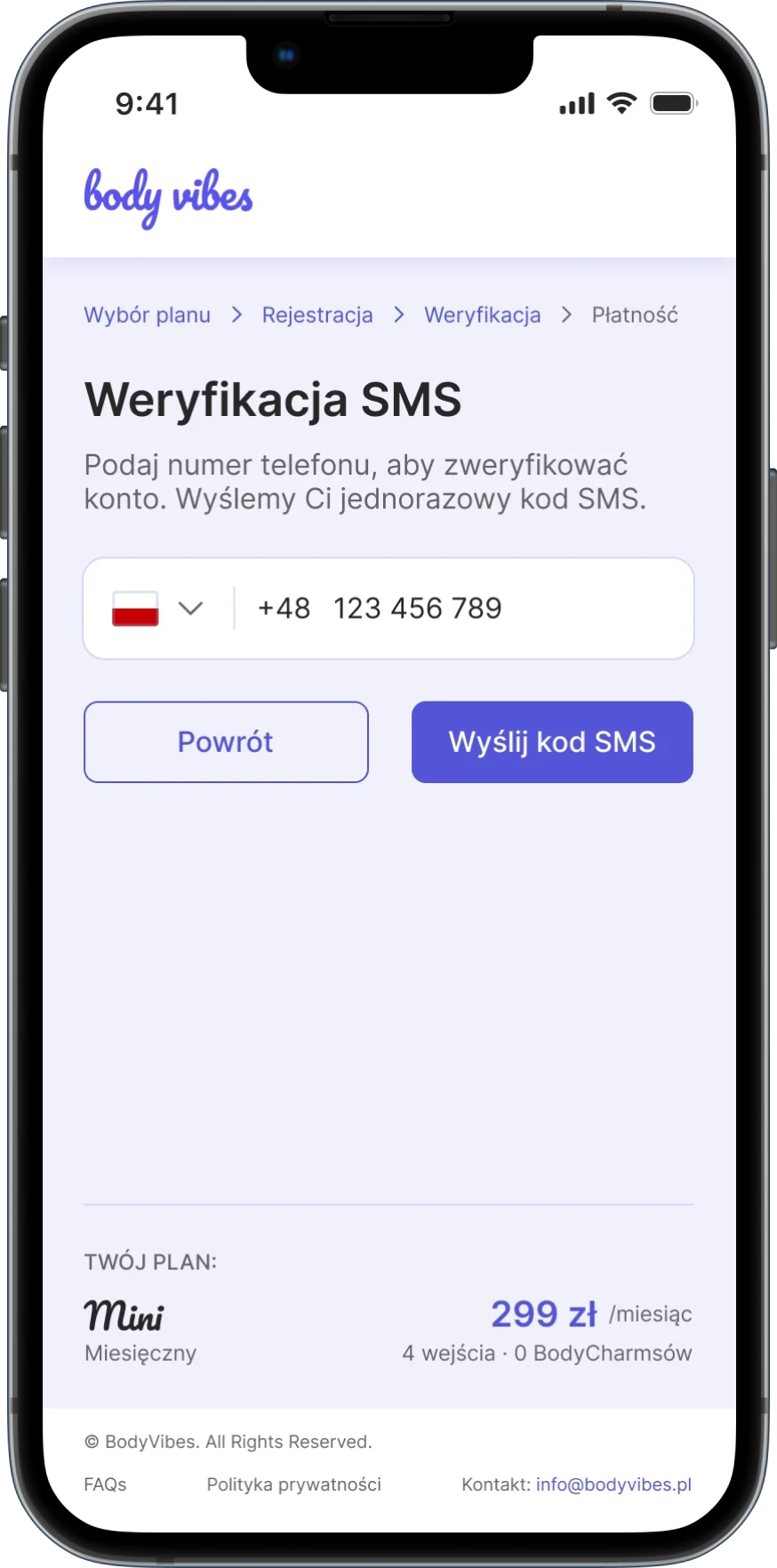
What changed?

Simplified flow

Fewer distractions and clearer steps from start to finish.

Simplified flow

Fewer distractions and clearer steps from start to finish.

Simplified flow

Fewer distractions and clearer steps from start to finish.

Clearer hierarchy

Each screen focuses on one clear action.

Clearer hierarchy

Each screen focuses on one clear action.

Clearer hierarchy

Each screen focuses on one clear action.

Better feedback

Progress and verification states make the flow easier to follow.

Better feedback

Progress and verification states make the flow easier to follow.

Better feedback

Progress and verification states make the flow easier to follow.

Turning feedback into a better experience

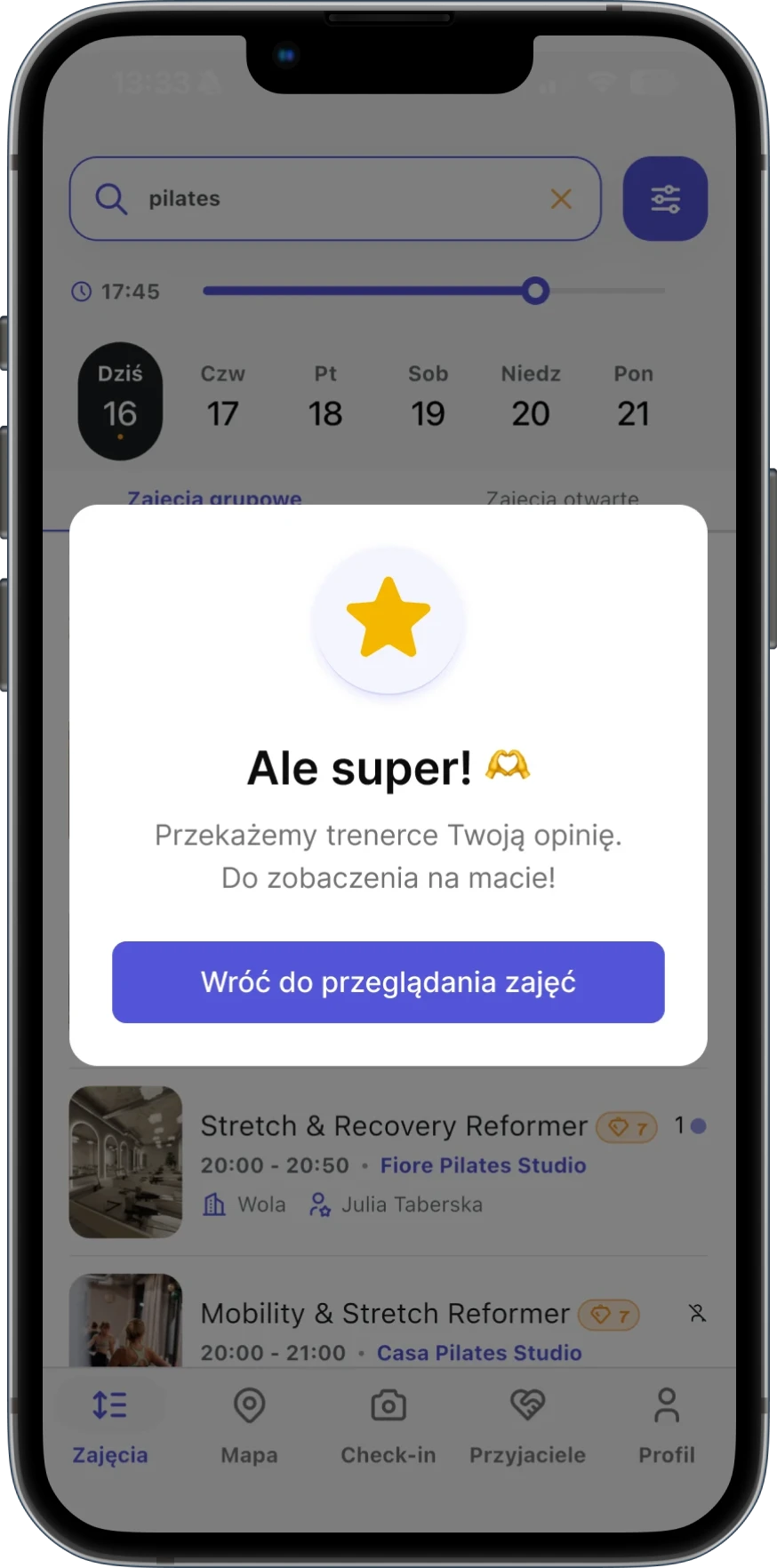
Problem: Users had no way to share feedback after a class.

A new rating flow that lets users review classes in seconds and see their feedback reflected on the platform.
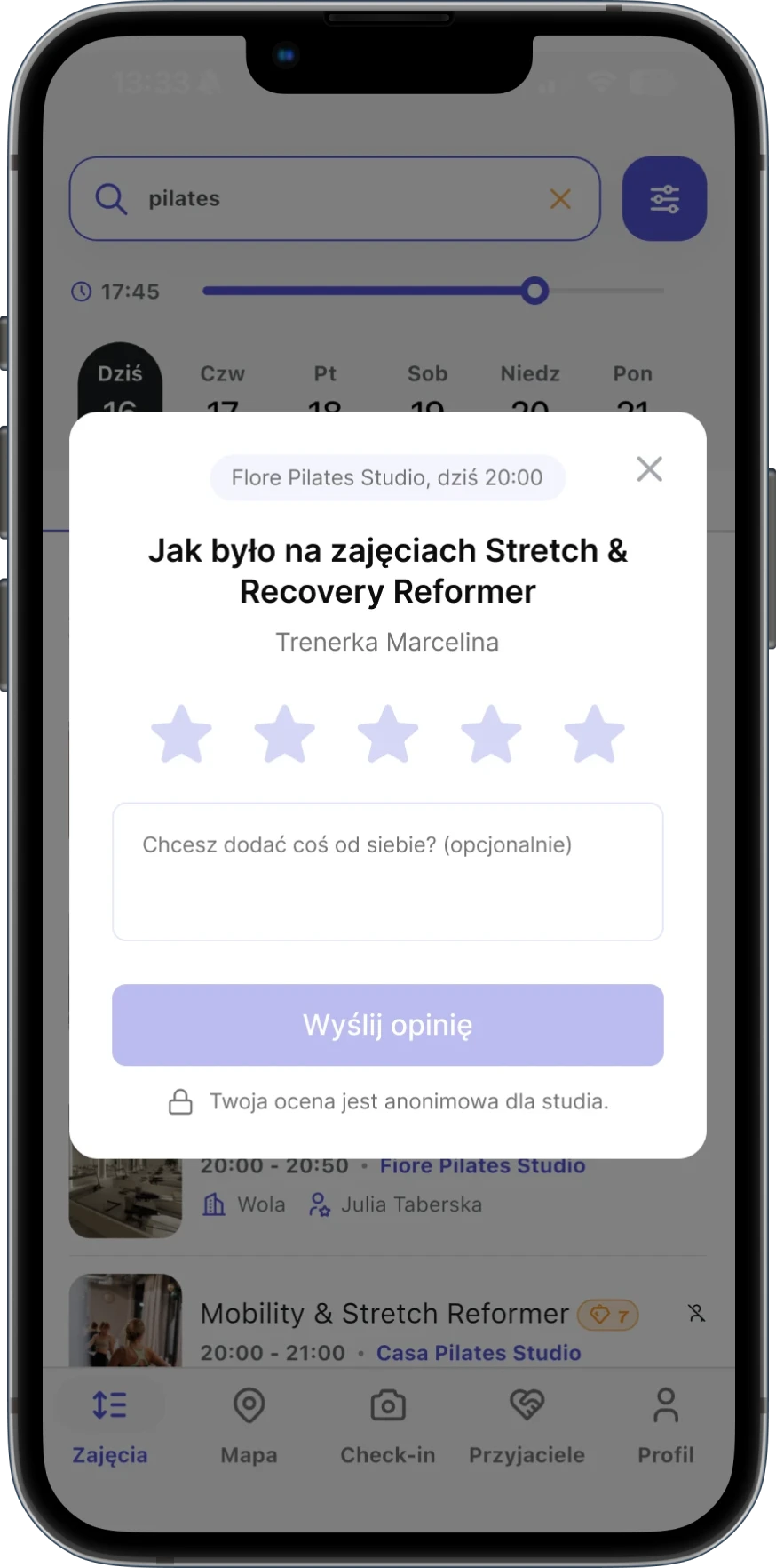
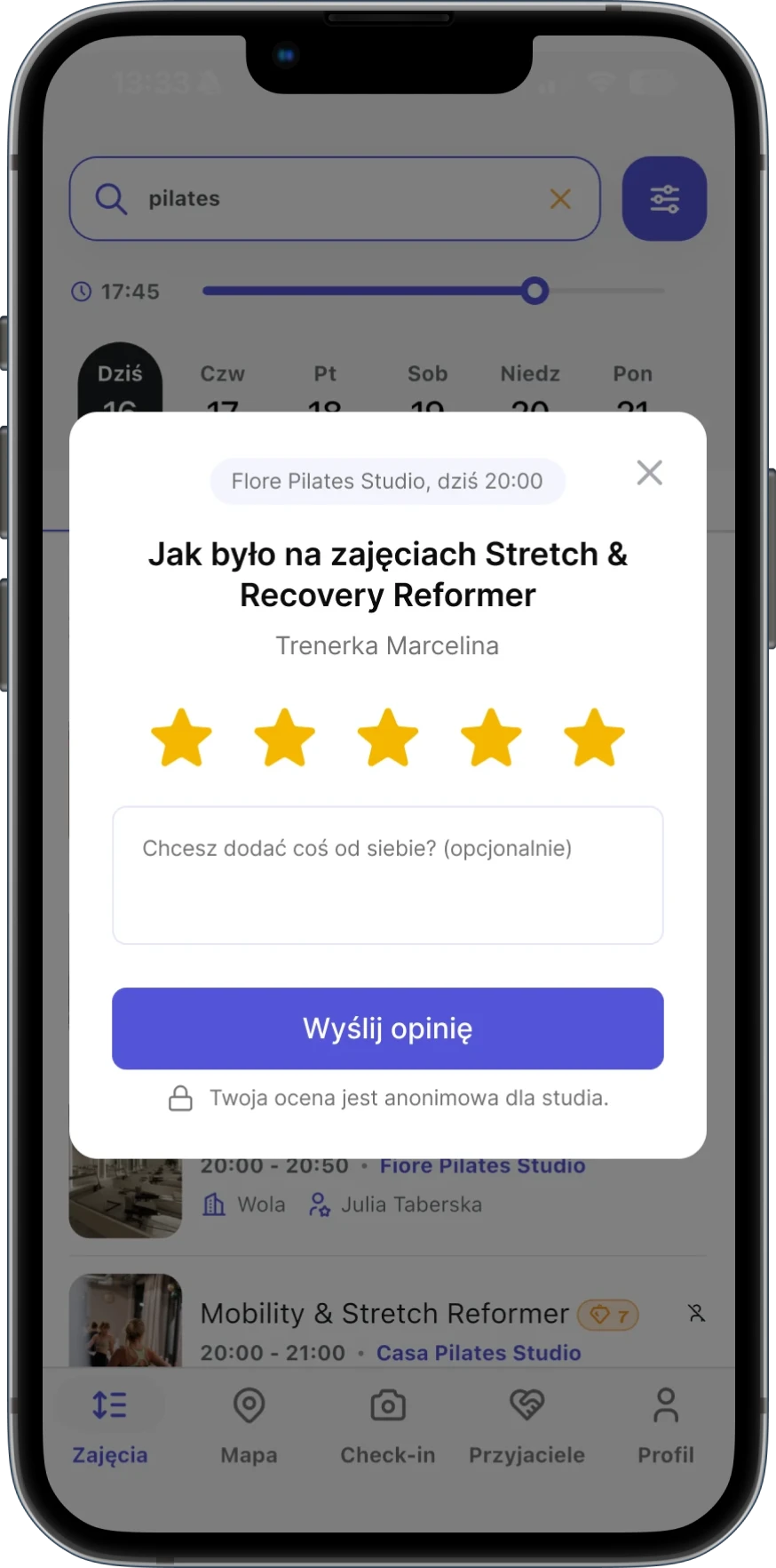
Rate

Users rate a class in
seconds with stars.

Users rate a class in
seconds with stars.

Add context

An optional comment
adds more detail.

An optional comment
adds more detail.

Confirm

A confirmation closes the loop
and keeps users moving.

A confirmation closes the loop
and keeps users moving.

Rate

Users rate a class in seconds with stars.

Context

An optional comment adds more detail.

Confirm

A confirmation
closes the loop.

From inviting friends to sharing the flow

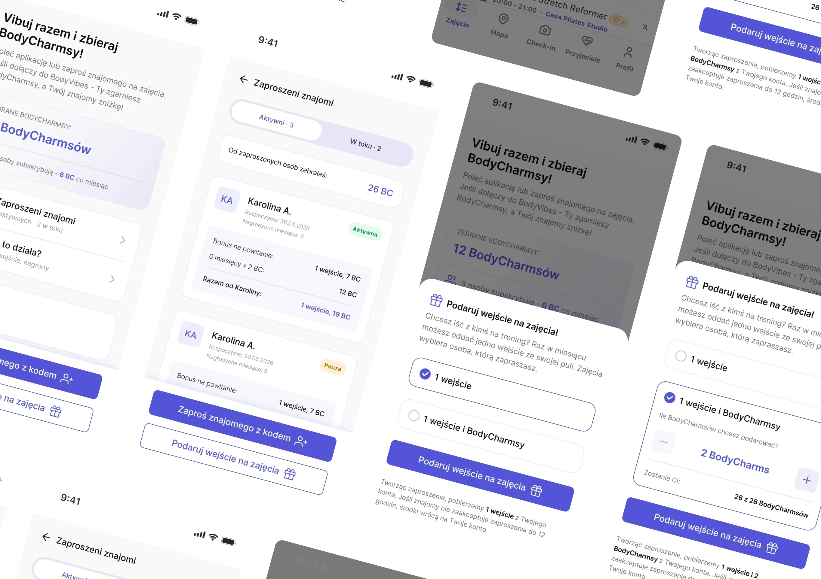
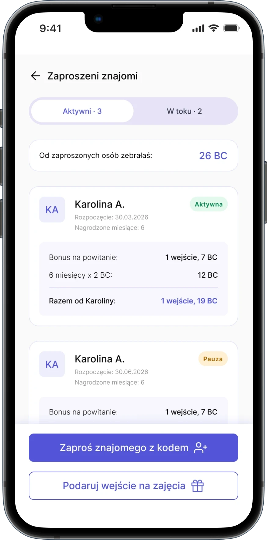
Problem: Inviting friends was hard to find and rewards were hard to track.

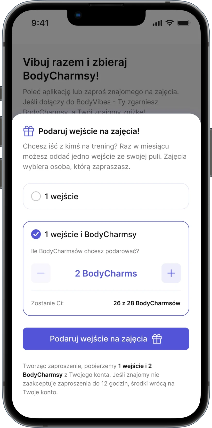
I redesigned the Friends section to make inviting friends, tracking rewards and sharing unused entries easier. I also designed gifting for BodyCharms (subscription points users spend on premium classes), so users can share them with friends.

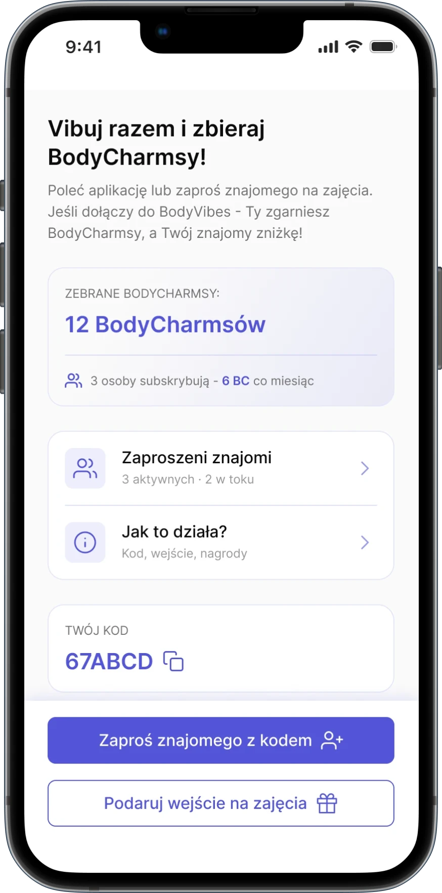
Working out together: more ways to invite, share and earn, all in one place.
Before:

After:

Rate

Users rate a class in seconds with stars.

Context

An optional comment adds more detail.

Confirm

A confirmation
closes the loop.

Explaining BodyCharms from the start

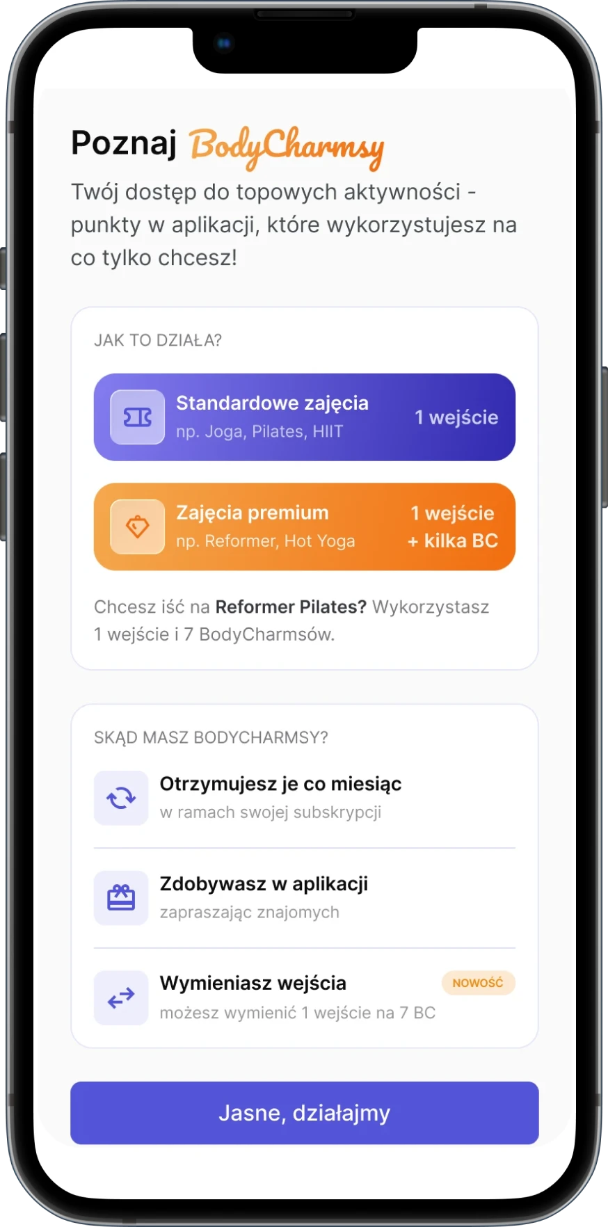
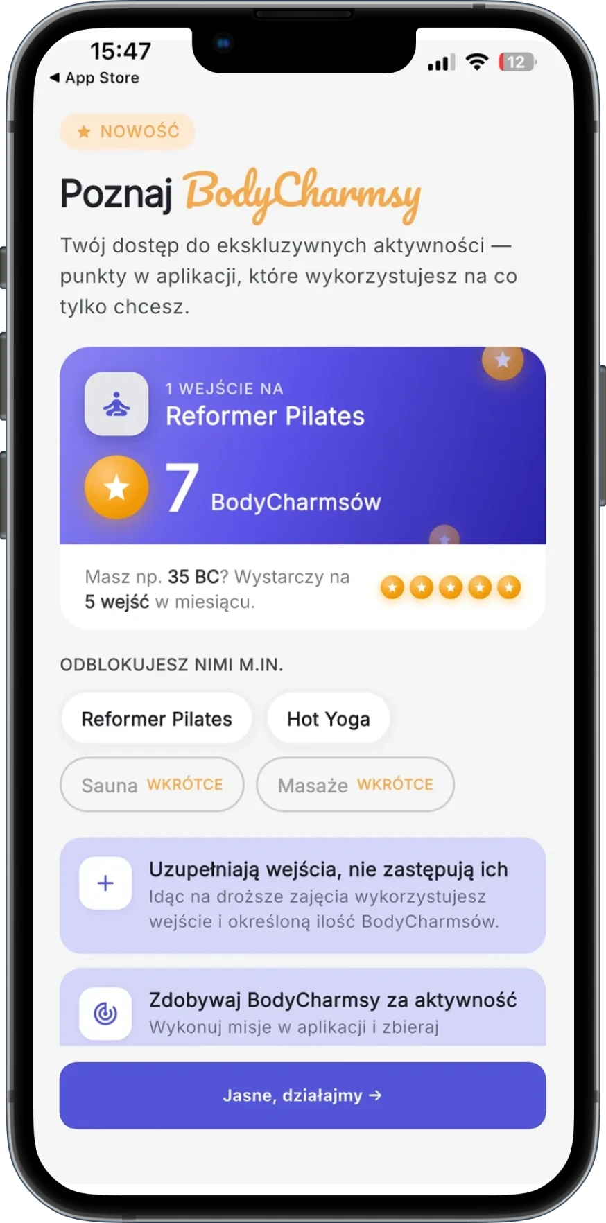
Problem: New users didn’t understand what BodyCharms were or how to use them.

I redesigned the onboarding to explain BodyCharms clearly and introduced the new exchange feature right in the flow.
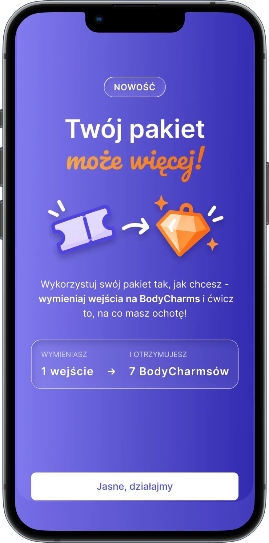
What changed?

Set the foundation

The first screen explains what BodyCharms are, how they work and what they unlock.

Set the foundation

The first screen explains what BodyCharms are, how they work and what they unlock.

Simplified flow

The first screen explains what BodyCharms are, how they work and what they unlock.

Make it actionable

A clear example shows how BodyCharms can be used.

Make it actionable

A clear example shows how BodyCharms can be used.

Clearer hierarchy

A clear example shows how BodyCharms can be used.

Introduce the new

The last screen presents BodyCharms exchange and invites users to try it.

Introduce the new

The last screen presents BodyCharms exchange and invites users to try it.

Introduce the new

The last screen presents BodyCharms exchange and invites users to try it.

Where product meets marketing: onboarding that educates and promotes new features at the same time.

What I delivered:

0
1
2
3
4
5
x REDESIGNED FLOWS
0
1
2
3
4
5
x REDESIGNED FLOWS

Improvements across the whole app journey, from signing up and choosing a plan to rating classes and sharing points.

FLOWS

0
1
2
3
4
5
x REDESIGNED