Design system for Localo - a local SEO app

Bringing order to a
fast-growing website

Bringing order to
a fast-growing site

A scalable design system and redesigned product pages that unified Localo's website and sped up future page creation.

COMPANY

Localo

Localo

ROLE

Product Designer

Product Designer

SCOPE

Design system · Product pages

Design system ·
Product pages

RESULT

10+ pages redesigned

10+ pages redesigned

What changed?

The product had more to offer than the website was showing

The website grew faster than its design foundation. Pages were built independently, so layouts, typography and components drifted apart.
80+ typography variants, inconsistent layouts, fragmented components.

One design system, reusable components,
a scalable page structure.

One design system, reusable components, a scalable page structure.

Why these changes?

Problem: Typography lacked consistency.

Solution: One shared type system.

Problem: Pages were built independently.

Solution: Reusable layouts and components.

Problem: Pages were built independently.

Solution: Reusable layouts and components.

Problem: Content-heavy pages were hard to scan.

Solution: Clearer hierarchy and structure.

Problem: Navigation couldn't scale with new features.

Solution: A new information architecture.

Problem: Navigation couldn't scale with new features.

Solution: A new information architecture.

80+ typography variants, inconsistent layouts, fragmented components.

One design system, reusable components, a scalable page structure.

Building a scalable foundation

A shared design language replaced 80+ typography variants with reusable components, layouts and spacing rules, the base for every future page.

Applying the system in practice

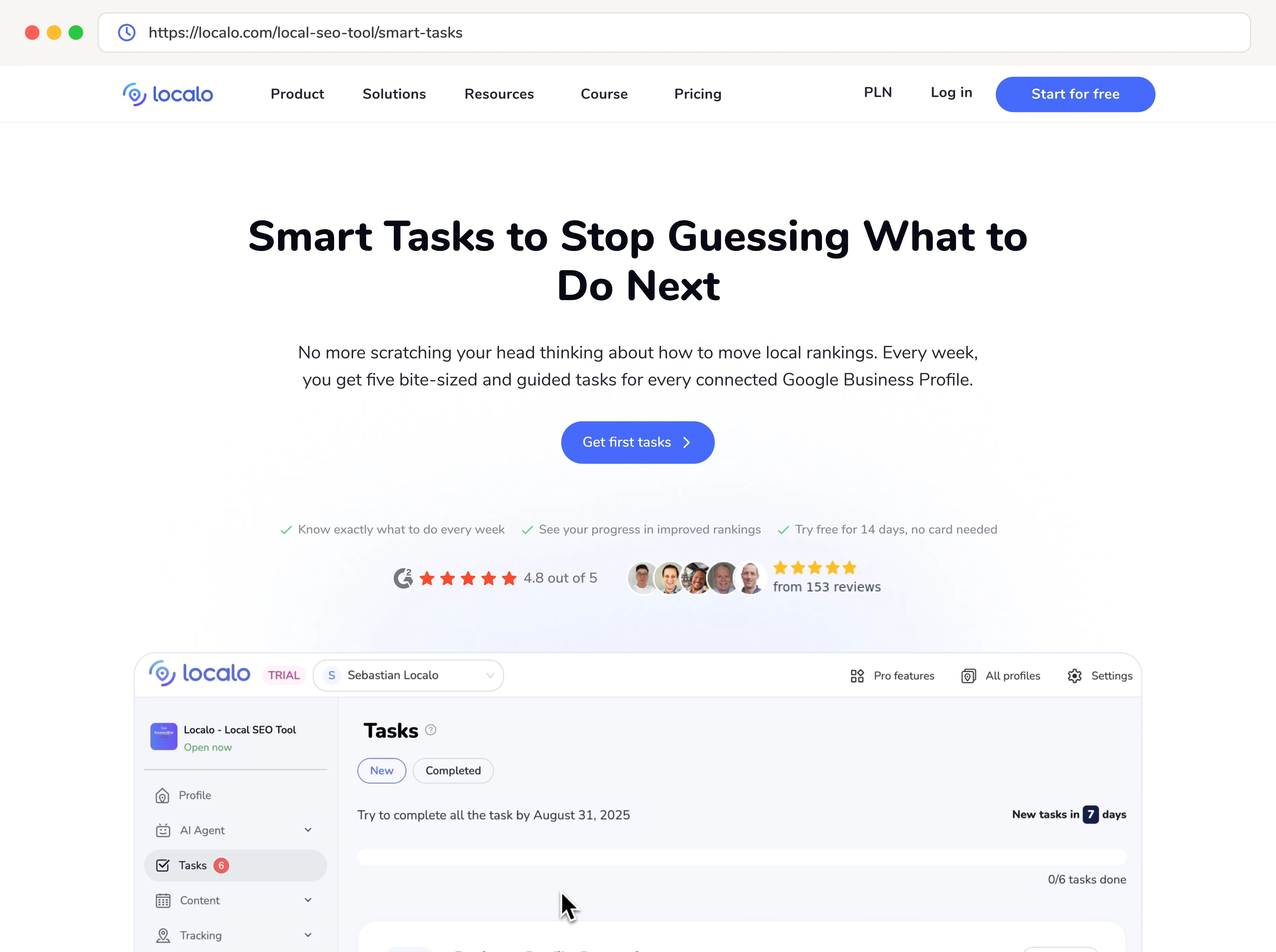
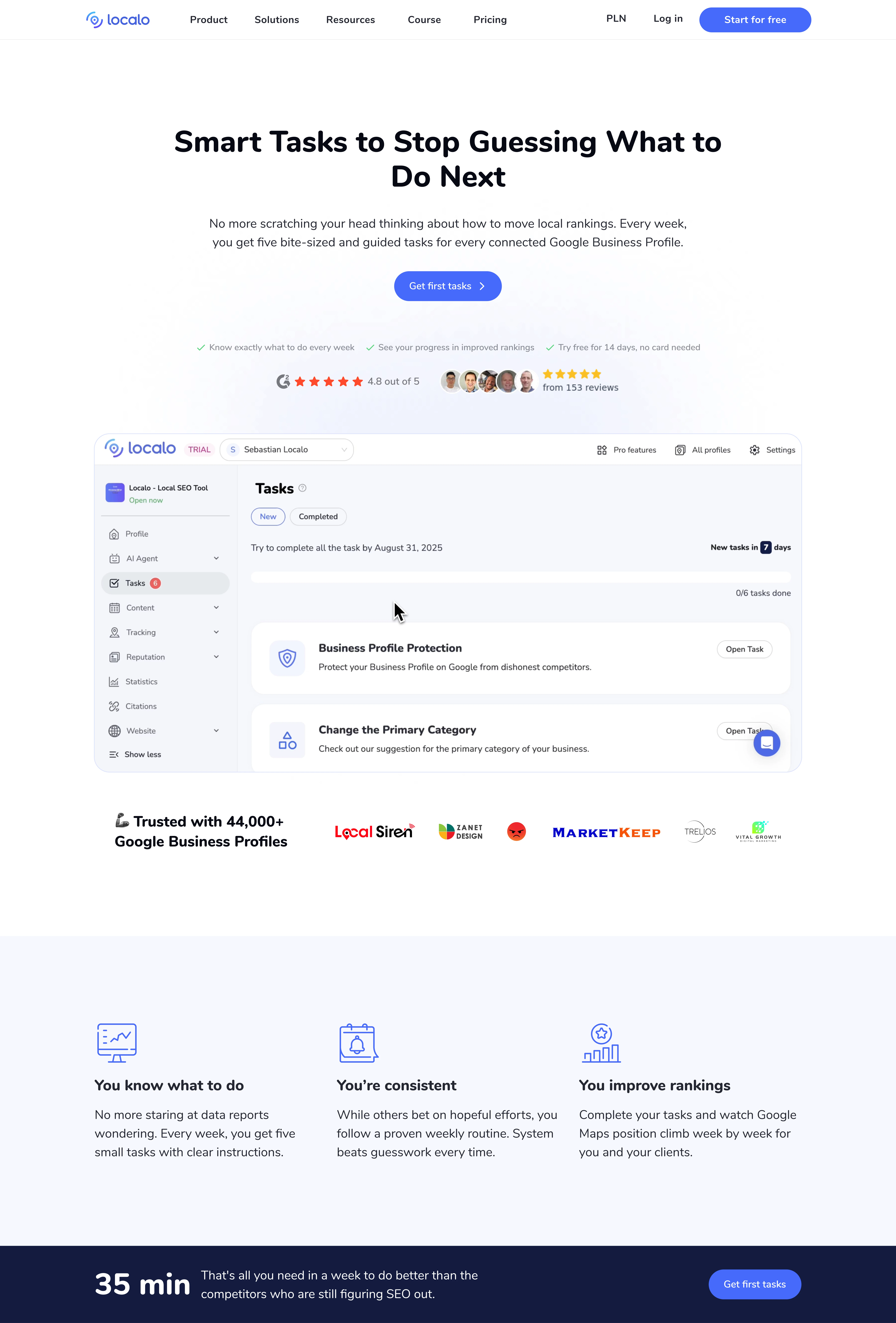
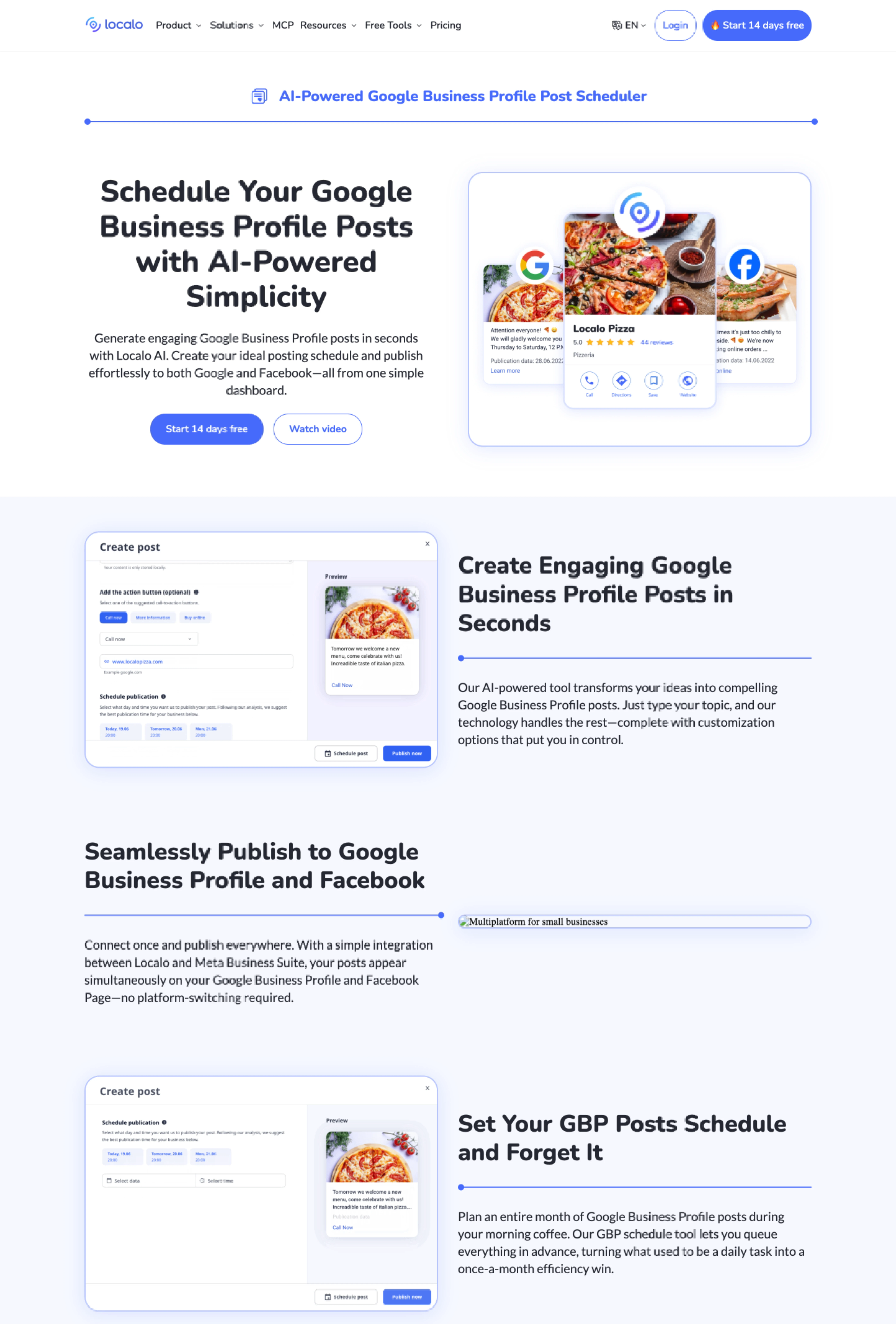
The system was rolled out across key product and content pages.
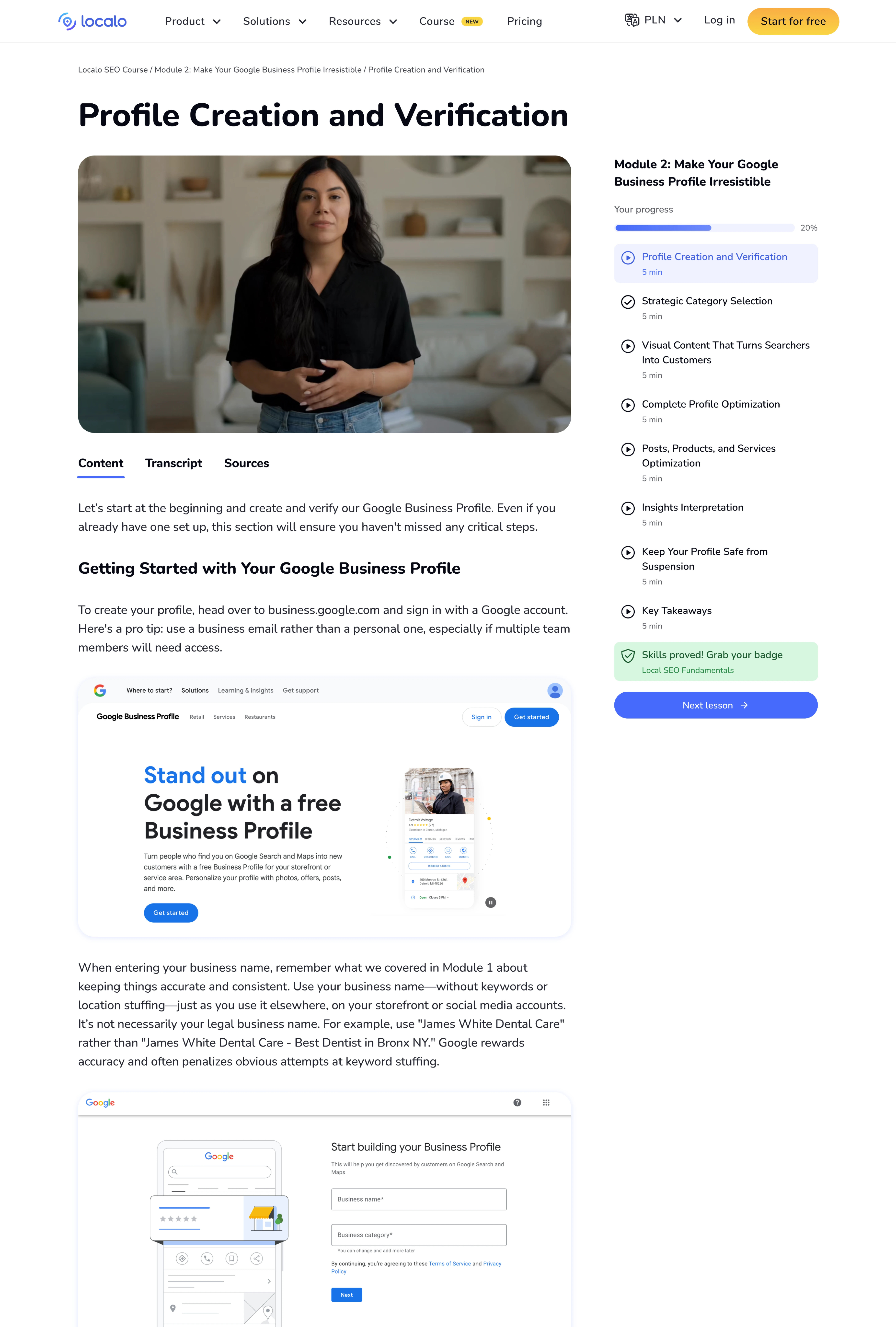
Video lessons with clear navigation and progress tracking.

Better readability for long, research-driven articles.

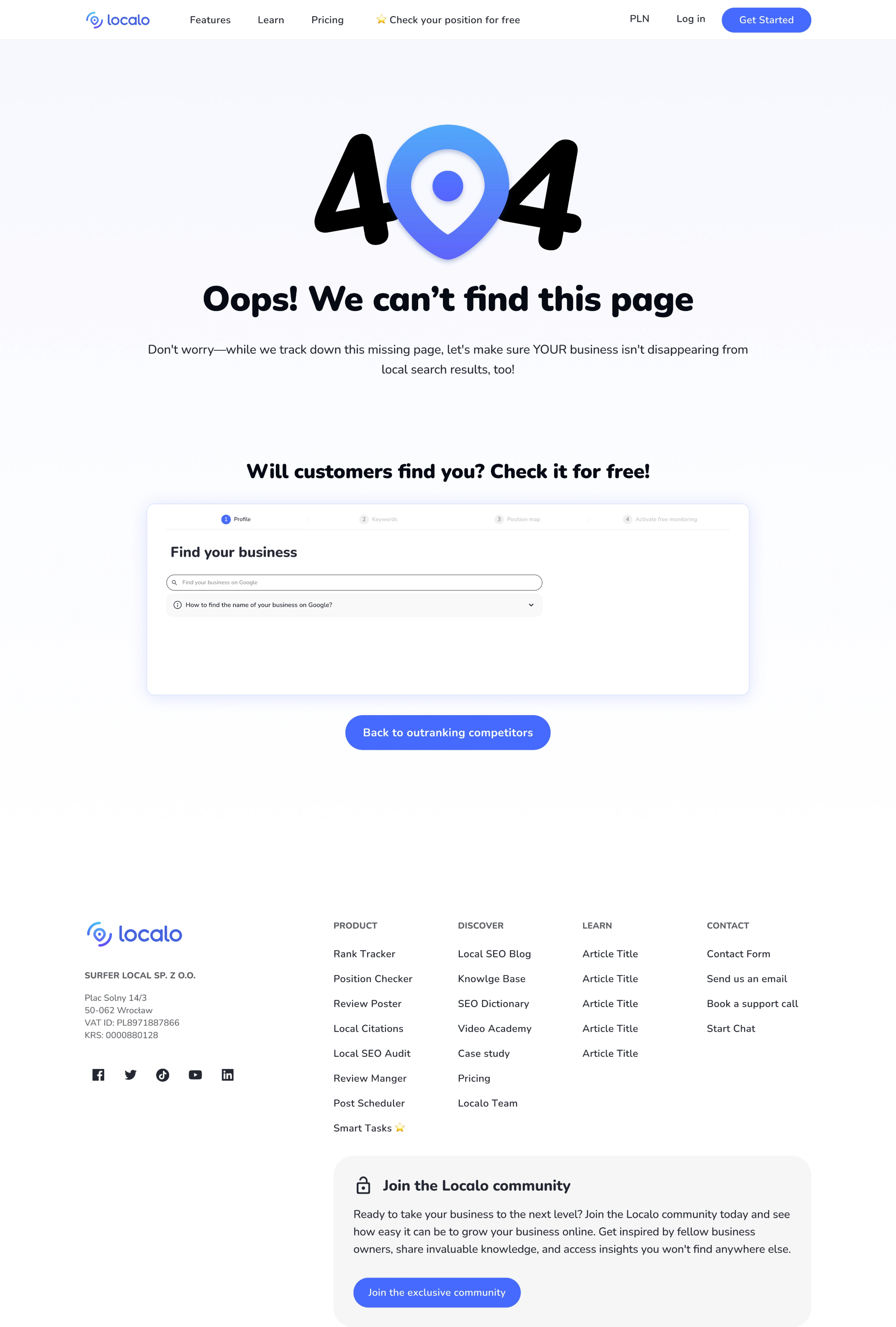
From a dead end to an acquisition touchpoint.

Video lessons with clear navigation and progress tracking.

Video lessons with clear navigation and tracking.

Better readability for long, research-driven articles.

From a dead end to an acquisition touchpoint.

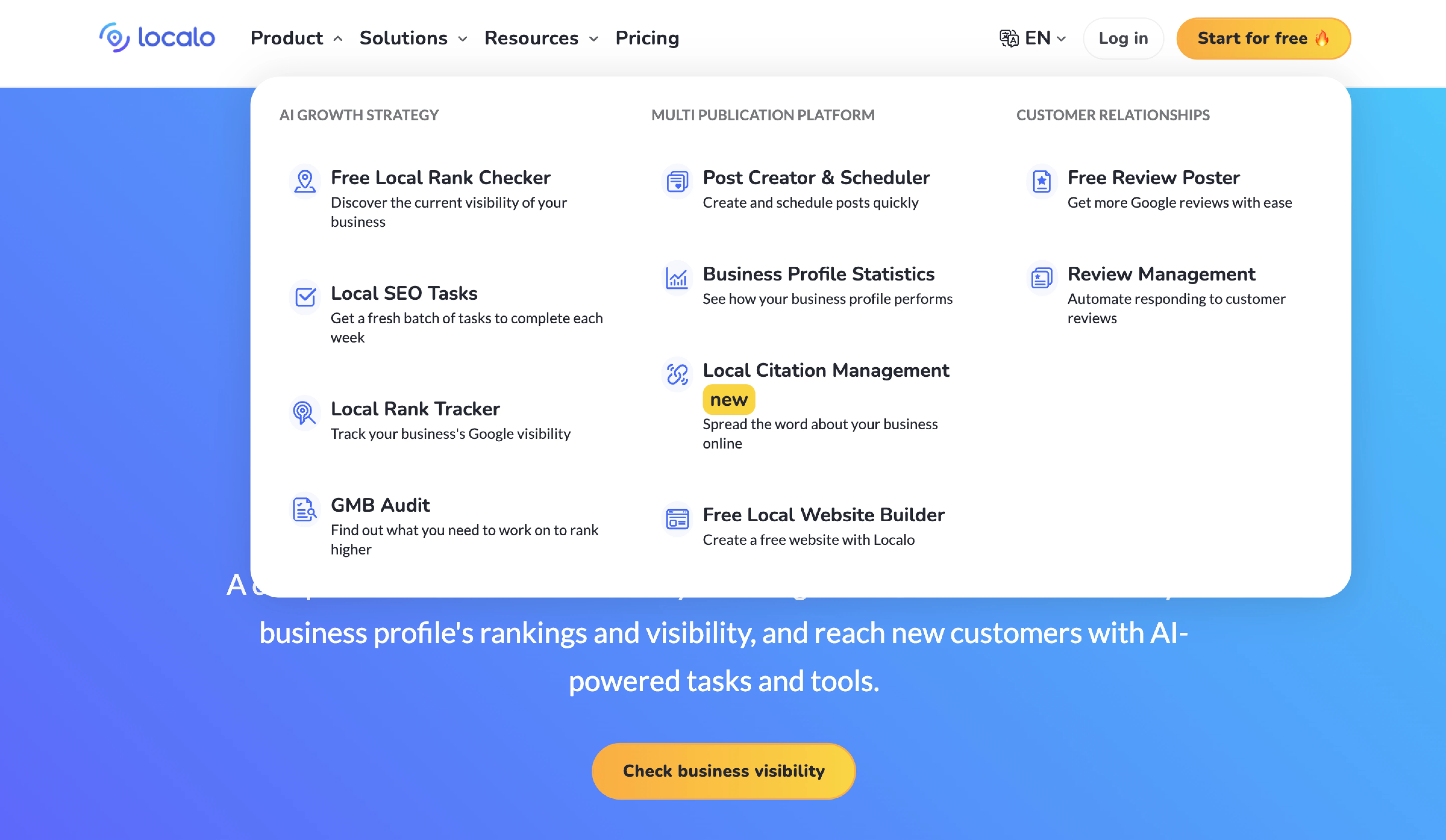
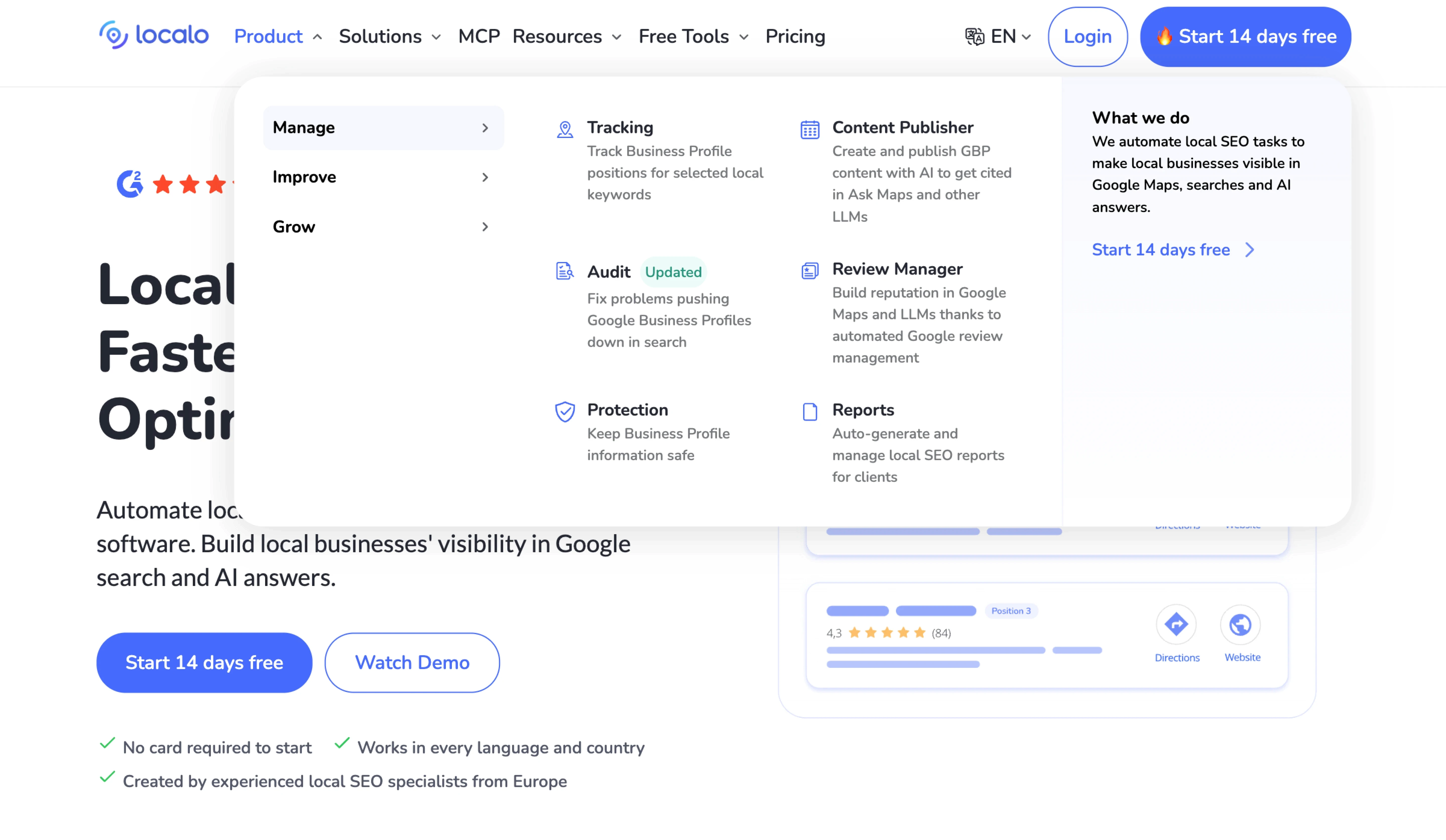
Navigation that scales

As new tools were added, the old menu got harder to scan. Features are now grouped into clear categories with contextual navigation.
The result:

REDESIGNED

0
1
0
+ PAGES REDESIGNED
0
1
0
+ PAGES
0
1
0
+ PAGES REDESIGNED

One visual language across product, content and marketing pages.