Santander Bank - new mobile app feature

Making saving feel less like banking

Making saving feel less like banking

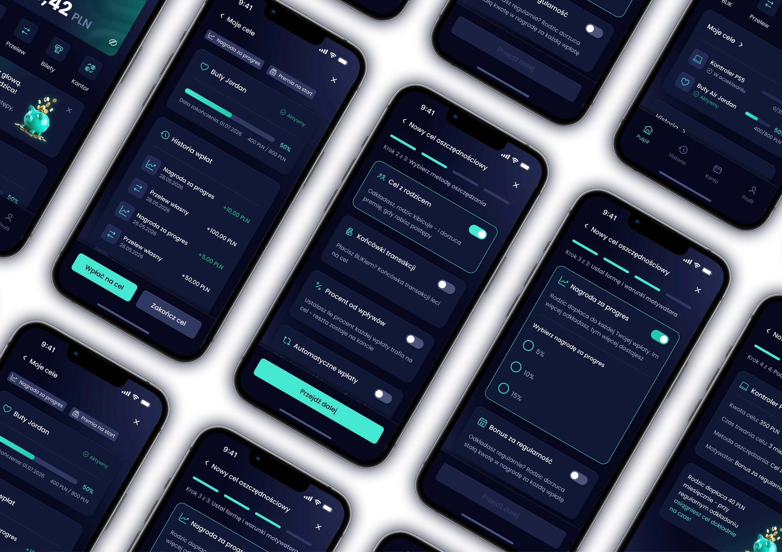
A university concept for Santander Bank Polska’s mobile app, designed to make saving more engaging, understandable and rewarding for teenagers aged 13–17.

UNIVERSITY

Cracow University of Technology

Cracow University of Technology

ROLE

UX Researcher · Product Designer

UX Researcher ·
Product Designer

EXPERTISE

UX/UI Design

UX/UI Design

SCOPE

Discover & Define

Discover & Define

Saving wasn’t the problem. Staying consistent was

For teenagers, saving money can feel distant from everyday life. My challenge was to turn an abstract financial habit into something visible, understandable and motivating, without making the experience feel childish.

of teenagers save towards a goal

of teenagers save towards a goal

of teenagers save towards a goal

say lack of knowledge is their biggest barrier

say lack of knowledge is their biggest barrier

say lack of knowledge is their biggest barrier

don't understand how banks talk to them

don't understand how banks talk to them

don't understand how banks talk to them

Based on a survey (50 responses), 5 in-depth interviews, 2 industry reports and an analysis of 4 competitors.


Meet Kuba

15, high school student from Kraków. Uses TikTok and Instagram, loves dynamic apps he can personalize. His money comes mostly from gifts and side jobs.

What motivates him:

Personalization · Quick feedback · Rewards · Language that speaks to him

What frustrates him:

No reward for effort · Mixed budgets · Uncontrolled spending · Overcomplicated apps

"I save roughly. I think I have some money, but by the end of the month it just disappears."

"I save roughly. I think I have some money, but by the end of the month it just disappears."

What the current app was missing

I mapped the current savings journey in the Santander app, from opening goals to closing them, step by step.

No rewards

Progress went unnoticed.

No rewards

Progress went unnoticed.

No rewards

Progress went unnoticed.

Flat visualization

Goals and progress looked unengaging.

Flat visualization

Goals and progress looked unengaging.

Flat visualization

Goals and progress looked unengaging.

Hidden goals

Savings goals were buried in the "More" menu.

Hidden goals

Savings goals were buried in the "More" menu.

Hidden goals

Savings goals were buried in the "More" menu.

Unclear impact

Users couldn't see how spending affected their goals.

Unclear impact

Users couldn't see how spending affected their goals.

Unclear impact

Users couldn't see how spending affected their goals.

So how might we…

So how might we…

…make saving feel motivating, visible and rewarding for teenagers?

…make saving feel motivating, visible and rewarding for teenagers?

Turning insights into product decisions

Each insight led directly to one part of the concept.

01

Make progress visible

02

Reward consistency

03

Reduce complexity

04

Make it personal

Saving felt abstract, and progress was hard to see.
→ Visual goals & milestones

Teens needed quick feedback, and 70.8% learn about money from their parents.
→ Rewards & parent contributions

38.7% don’t understand how banks talk to them.
→ Simple, modular Teen Dashboard

Teens love apps they can make their own, like TikTok or Discord.
→ Customisable experience

01

Make progress visible

Saving felt abstract, and progress was hard to see.
→ Visual goals & milestones

02

Reward consistency

Teens needed quick feedback, and 70.8% learn about money from their parents.
→ Rewards & parent contributions

03

Reduce complexity

38.7% don’t understand how banks talk to them.
→ Simple, modular Teen Dashboard

04

Make it personal

Teens love apps they can make their own, like TikTok or Discord.
→ Customisable experience

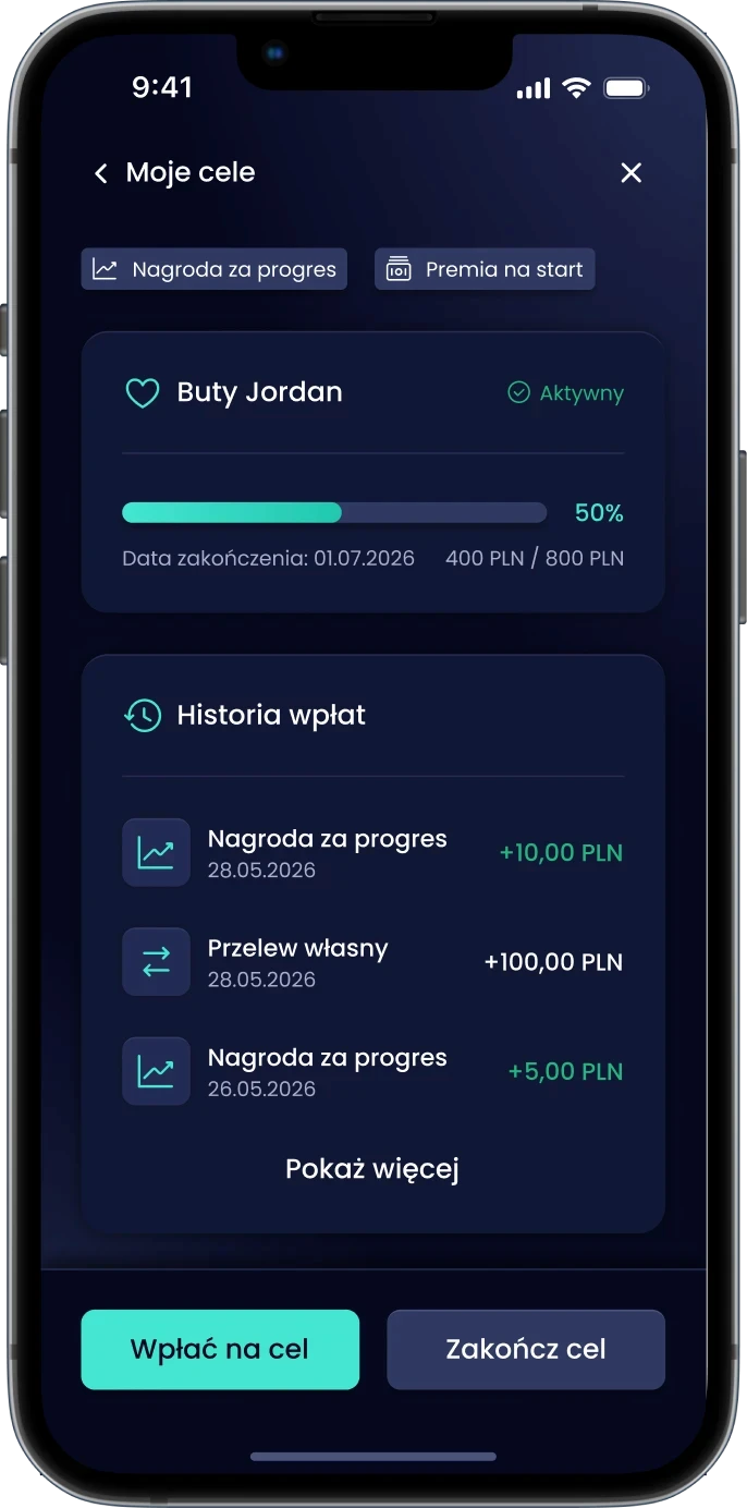
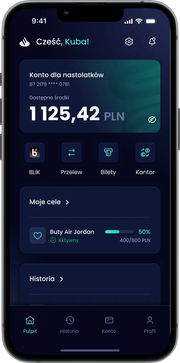
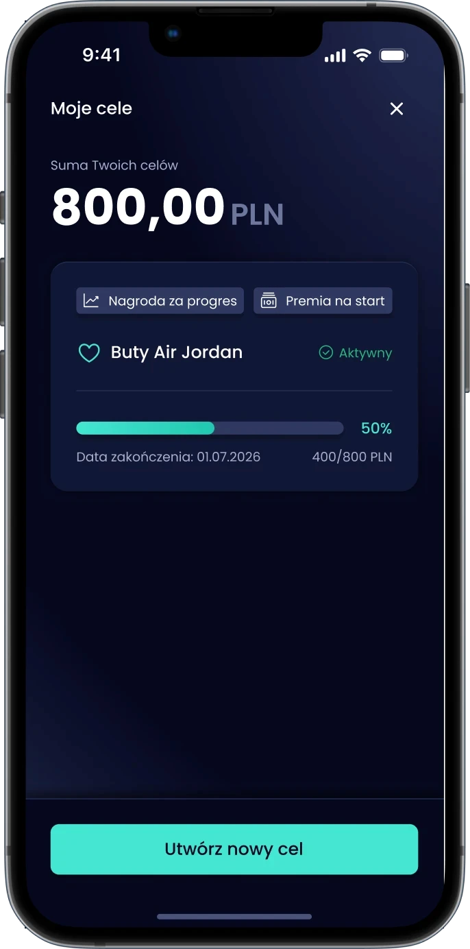
Goals on the home screen. Always

A dedicated savings layer inside the Santander app: dark, focused and goal-first. Progress is visible every time users open the app.
Four steps: from idea to active goal

A guided path with fewer decisions and one tap to send the goal to a parent.

Define the goal

Name, amount, deadline and an icon.

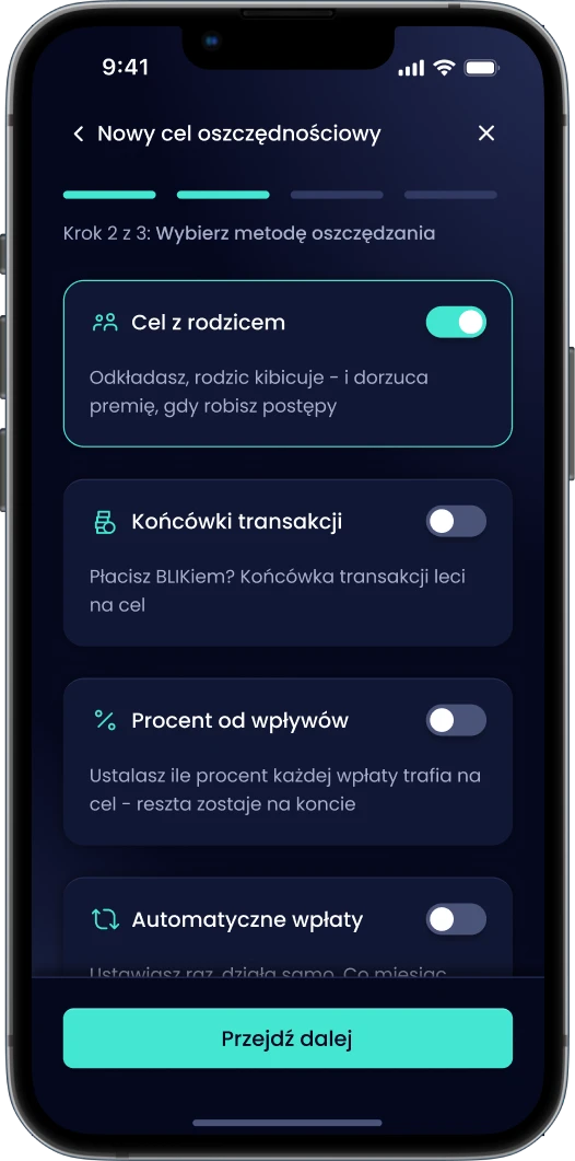
Pick a method

Pick what fits, no manual planning.

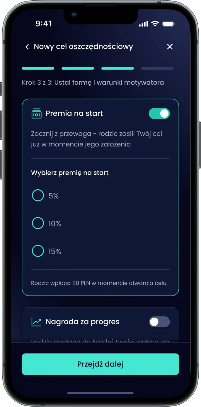
Set motivators

Choose how a parent rewards progress.

Send request

Review the summary and send it to a parent.

Define the goal

Name, amount, deadline and an icon.

Name, amount, deadline and an icon.

Pick a method

Pick what fits, no manual planning.

Pick what fits, no manual planning.

Set motivators

Choose how a parent rewards progress.

Choose how a parent rewards progress.

Send request

Check the summary and send it to a parent.

Check the summary and send it to a parent.

Fits actual habits

Users pick the saving method that works for them. No manual planning required.
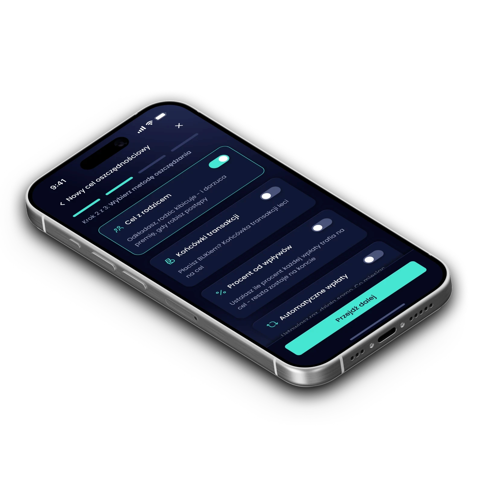
Goal with parent (NEW)

Teen sets the terms, parent approves. Collaboration without surveillance.

Goal with parent (NEW)

Teen sets the terms, parent approves. Collaboration without surveillance.

Goal with parent (NEW)

Teen sets the terms, parent approves. Collaboration without surveillance.

Transaction roundups

Paying with BLIK? The roundup goes straight to the goal.

Transaction roundups

Paying with BLIK? The roundup goes straight to the goal.

Transaction roundups

Paying with BLIK? The roundup goes straight to the goal.

Percent of income

A chosen % of every income goes to the goal; the rest stays on the account.

Percent of income

A chosen % of every income goes to the goal; the rest stays on the account.

Percent of income

A chosen % of every income goes to the goal; the rest stays on the account.

Auto transfers

Set a weekly amount. The app handles the rest.

Auto transfers

Set a weekly amount. The app handles the rest.

Unclear impact

Set a weekly amount. The app handles the rest.

Real money. Not badges

The parent commits to a reward type upfront: negotiated, transparent and automatic.
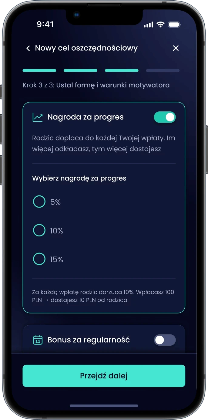
Progress reward

The parent tops up every deposit by a chosen percentage. The more the teen saves, the more they get.

Regularity bonus

The parent adds a fixed bonus for every weekly deposit. Streaks have real financial value.

Head-start bonus

The parent seeds the goal the moment it's created. Starting from zero is the biggest barrier - this removes it.

Progress reward

The parent tops up every teenager's deposit.

Regularity bonus

The parent adds a fixed weekly bonus.

Head-start bonus

The parent gives some money at the beginning.

Why it looks and works the way it does

Dark UI in a banking app

Dark feels premium to Gen Z: games, streaming, social. Theirs, not their parents'.

Dark UI in a banking app

Dark feels premium to Gen Z: games, streaming, social. Theirs, not their parents'.

Dark UI in a banking app

Dark feels premium to Gen Z: games, streaming, social. Theirs, not their parents'.

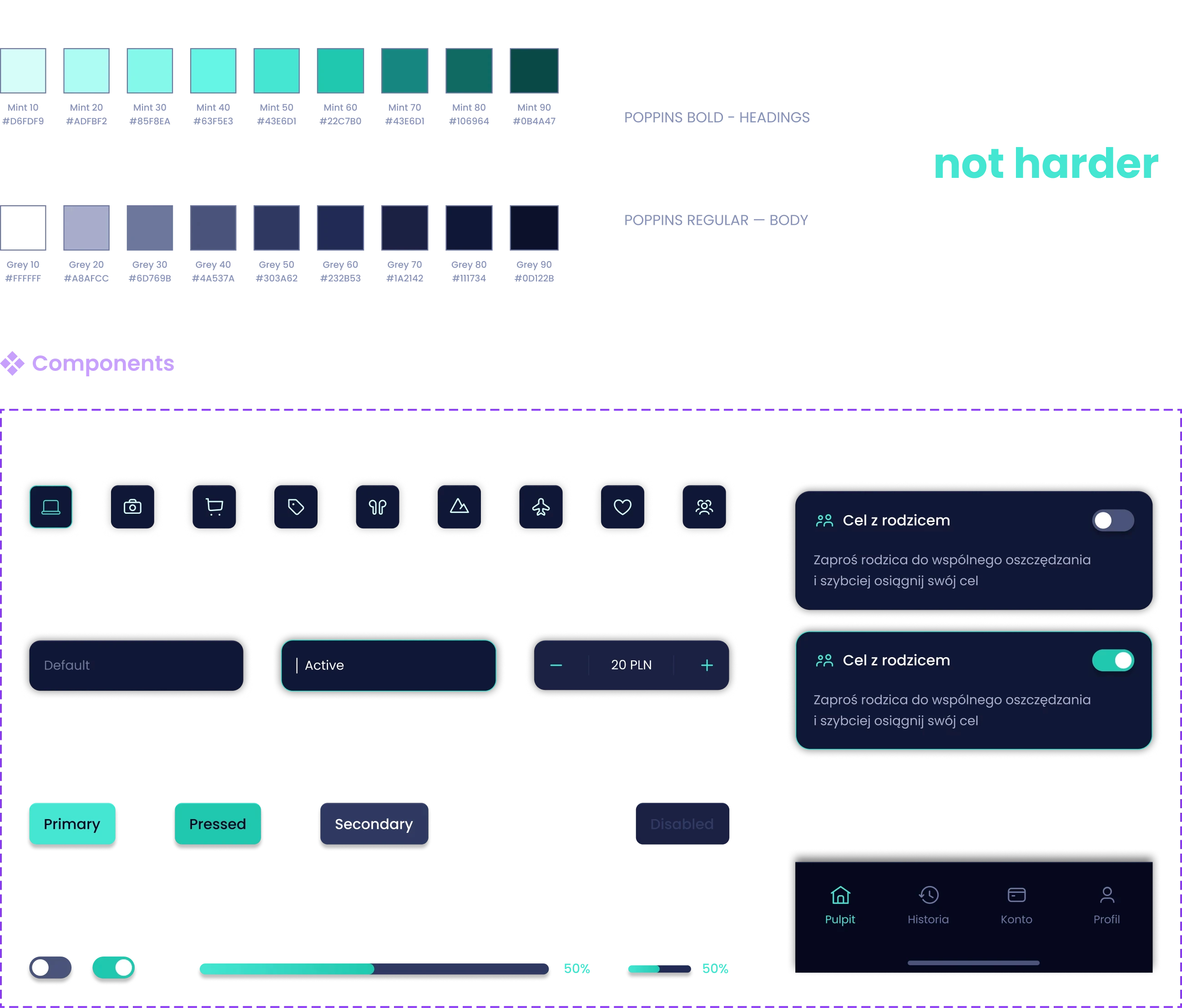
Mint means progress

Mint is reserved for progress, active states and rewards, so every win is easy to spot.

Mint means progress

Mint is reserved for progress, active states and rewards, so every win is easy to spot.

Mint means progress

Mint is reserved for progress, active states and rewards, so every win is easy to spot.

Plain, friendly language

The app talks like a friend, not a bank: "You save, your parent cheers, and adds a bonus when you make progress."

Plain, friendly language

The app talks like a friend, not a bank: "You save, your parent cheers, and adds a bonus when you make progress."

Plain, friendly language

The app talks like a friend, not a bank: "You save, your parent cheers, and adds a bonus when you make progress."

Money over points

Badges don't move money. The reward is a real deposit, worth saving for.

Money over points

Badges don't move money. The reward is a real deposit, worth saving for.

Money over points

Badges don't move money. The reward is a real deposit, worth saving for.

Style guide

Mint and deep navy with Poppins: clean, geometric and friendly, built to feel premium without feeling like a parents' bank.
The full flow: