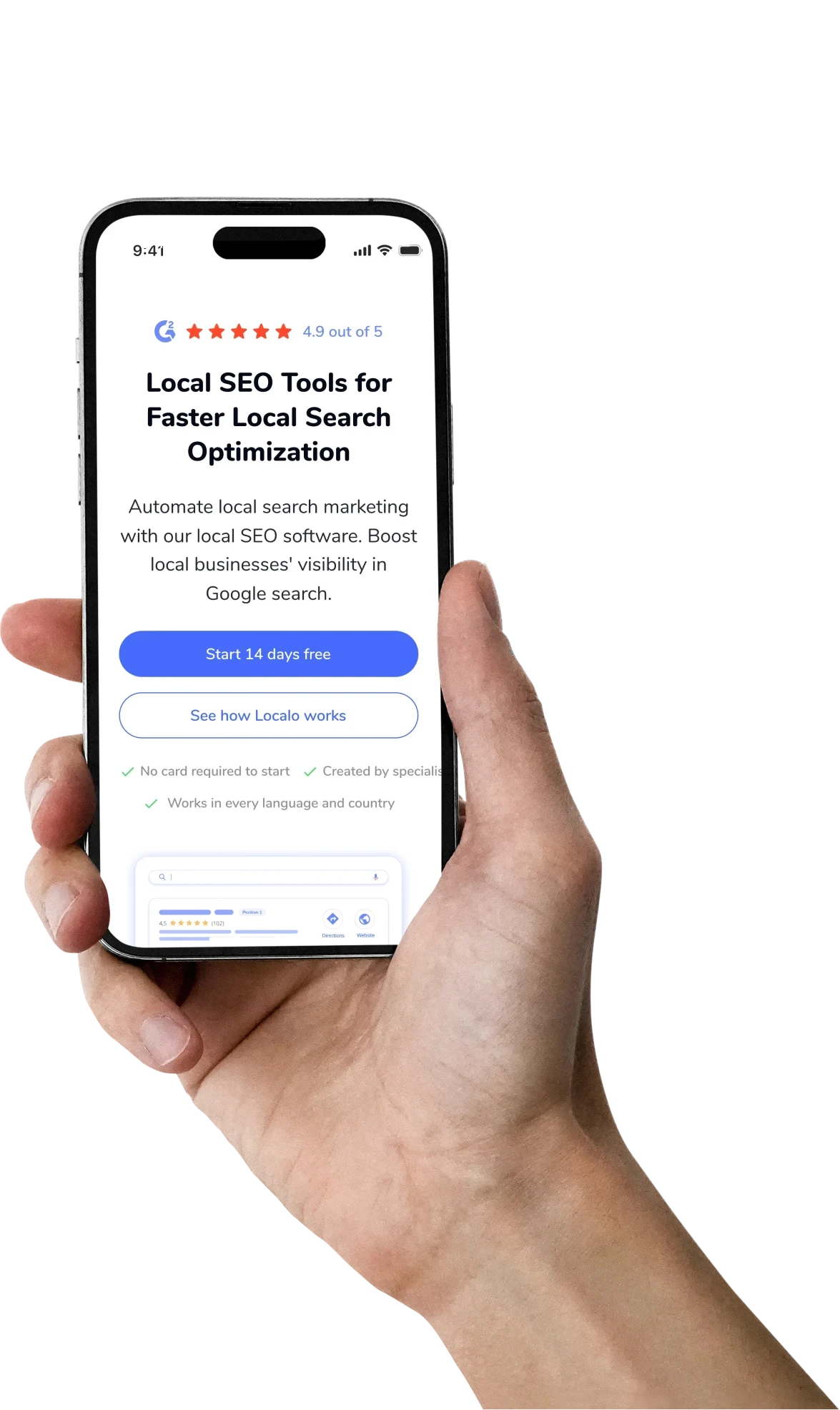
Homepage redesign for Localo - a local SEO app

How a clearer homepage lifted Localo’s signups by 32%

How a clearer homepage lifted signups by 32%

Localo’s homepage was getting traffic, but visitors weren’t getting the point fast enough. I redesigned it to communicate value on the first screen, show trust earlier, and guide people towards signup.

COMPANY

Localo

Localo

ROLE

Visual Designer

Visual Designer

EXPERTISE

UX/UI · Conversion design

UX/UI Design & Marketing

RESULT

+32% signups

+32% signups

The homepage had a clarity problem

Localo had a strong product, but its homepage hid the core message behind a video. Visitors had to press play or scroll before they understood what Localo offered, and the ratings and customer benefits that could convince them sat even further down the page.
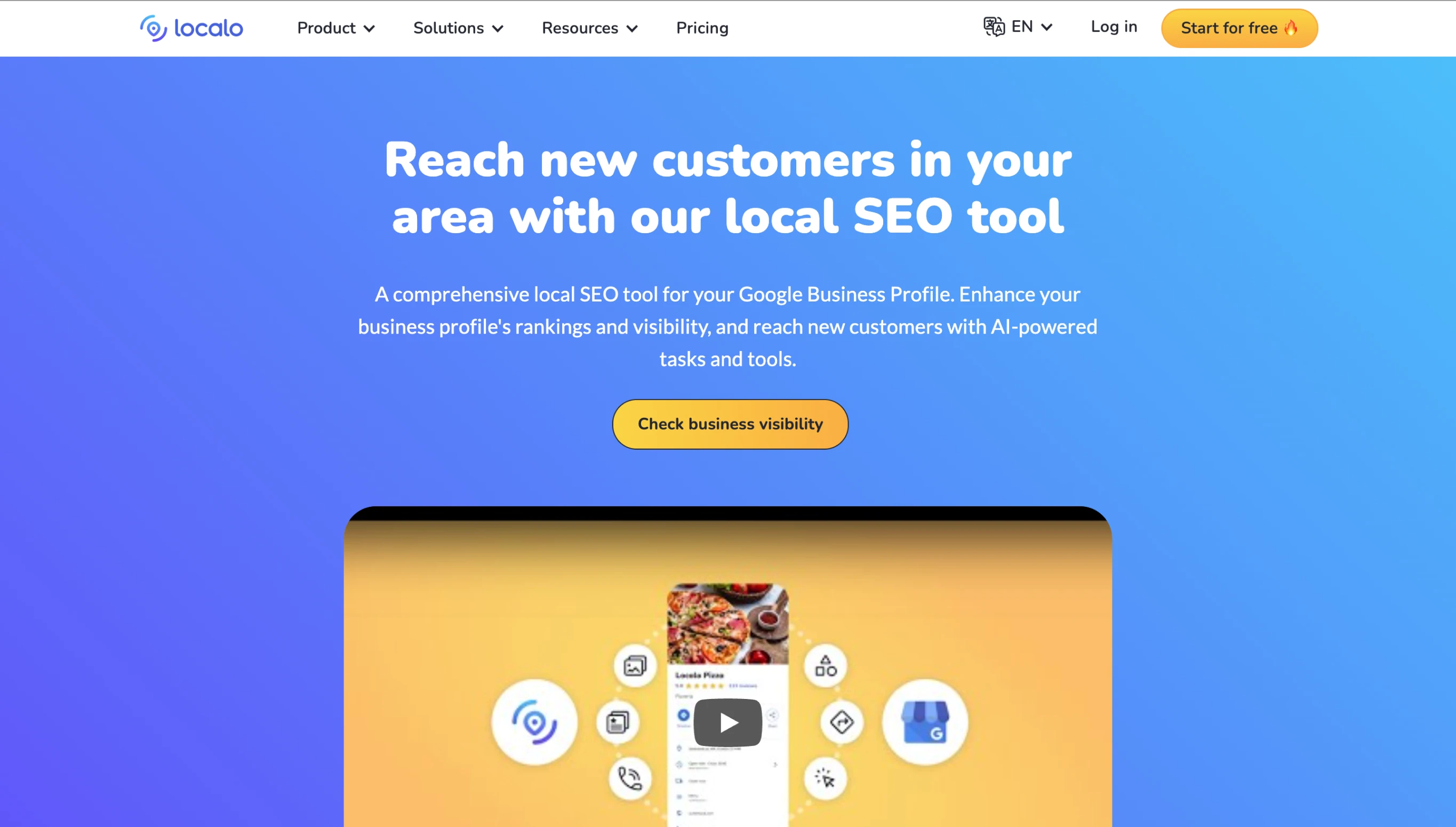
What wasn’t working?

The value wasn't obvious

The hero showed the product instead of explaining why it mattered.

The value wasn't obvious

The hero showed the product instead of explaining why it mattered.

The value wasn't obvious

The hero showed the product instead of explaining why it mattered.

Trust came too late

Ratings, social proof and credibility signals only appeared below the fold.

Trust came too late

Ratings, social proof and credibility signals only appeared below the fold.

Trust came too late

Ratings, social proof and credibility signals only appeared below the fold.

The message was too broad

Local business owners and Marketing agencies came with different goals, but the homepage spoke to everyone the same way.

The message was too broad

Local business owners and Marketing agencies came with different goals, but the homepage spoke to everyone the same way.

The message was too broad

Local business owners and Marketing agencies came with different goals, but the homepage spoke to everyone the same way.

Features lacked context

The page listed what the product could do, but not what users would achieve with it.

Features lacked context

The page listed what the product could do, but not what users would achieve with it.

Features lacked context

The page listed what the product could do, but not what users would achieve with it.

From insight to interface

01

UNDERSTAND

02

REFRAME

03

REDESIGN

04

REFINE

01

UNDERSTAND

I audited the homepage and found the core message was hidden behind a video.

02

REFRAME

I rebuilt the content around one question every visitor asks: What does Localo do for me?

03

REDESIGN

I explored hero concepts, a clearer hierarchy, stronger CTAs and trust signals.

04

REFINE

I refined the layout with team, focusing on clarity, hierarchy and conversion.

What I changed: one answer for each problem
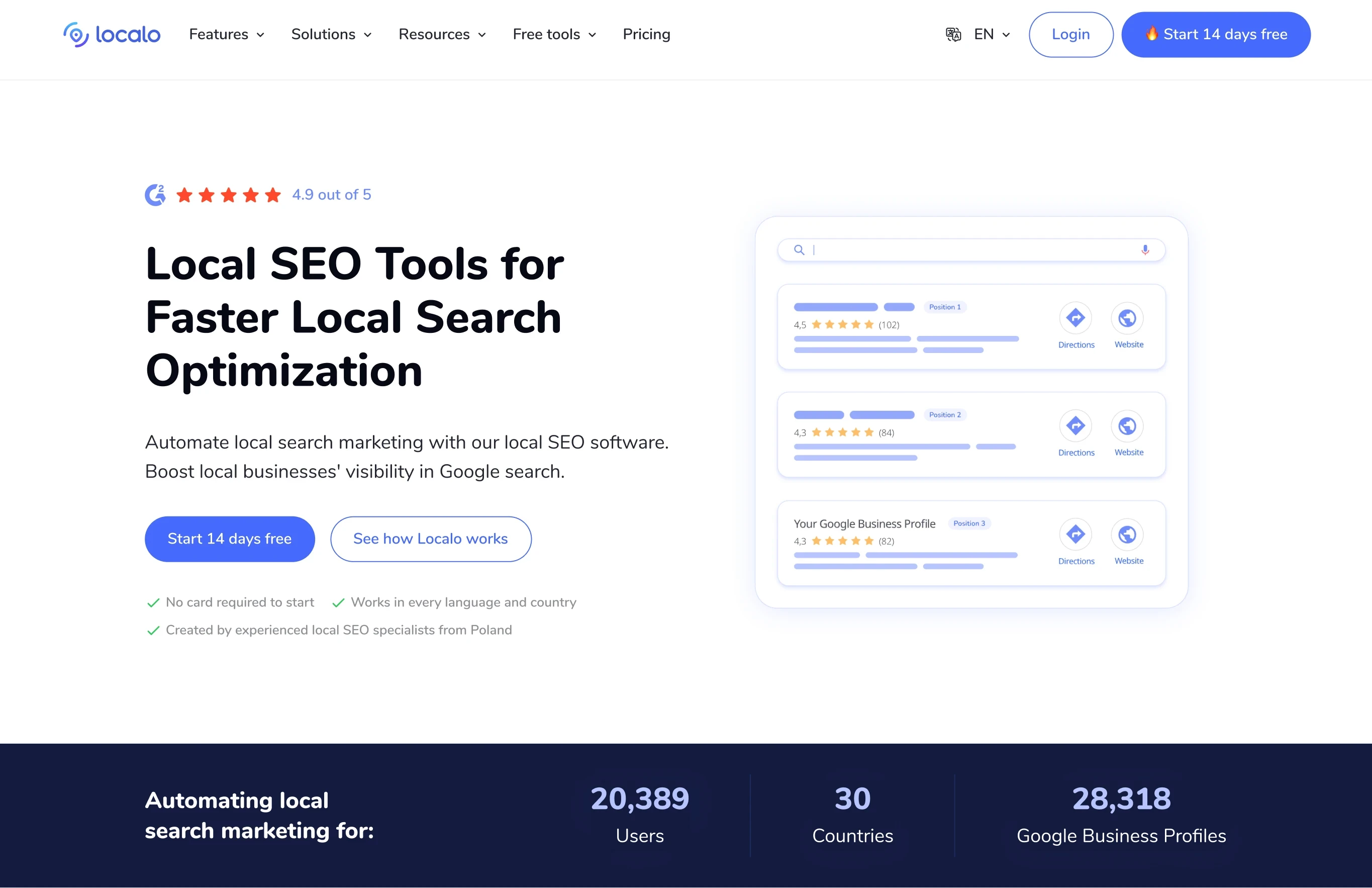
Show the outcome, not the product

The new hero visualizes the result users want, so the value is clear before anyone scrolls.

Show the outcome, not product

The new hero visualizes the result users want, so the value is clear before anyone scrolls.

Show the outcome, not the product

The new hero visualizes the result users want, so the value is clear before anyone scrolls.

Turn features into outcomes

Each feature section now leads with what users achieve, with the feature itself as supporting detail.

Turn features into outcomes

Each feature section now leads with what users achieve, with the feature itself as supporting detail.

Turn features into outcomes

Each feature section now leads with what users achieve, with the feature itself as supporting detail.

Speak to each audience

Instead of one broad message, the homepage now addresses Business Owners and Marketing Agencies with their own goals and entry points.

Speak to each audience

Instead of one broad message, the homepage now addresses Business Owners and Marketing Agencies with their own goals and entry points.

Speak to each audience

Instead of one broad message, the homepage now addresses Business Owners and Marketing Agencies with their own goals and entry points.

Move trust above the fold

Ratings, customer proof and credibility signals now sit right next to the first interaction, building confidence from the first screen.

Move trust above the fold

Ratings, customer proof and credibility signals now sit right next to the first interaction, building confidence from the first screen.

Move trust above the fold

Ratings, customer proof and credibility signals now sit right next to the first interaction, building confidence from the first screen.

From generic to specific

  • Generic → Specific

  • Features → Outcomes

  • Hidden trust → Visible proof

  • Generic → Specific

  • Features → Outcomes

  • Hidden trust → Visible proof

  • Generic → Specific

  • Features → Outcomes

  • Hidden trust → Visible proof

The result:

The redesign moved the metric that mattered most:

CONVERSION

+
0
1
2
3
0
1
2
% SIGNUP CONVERSION
+
0
1
2
3
0
1
2
% SIGNUP
+
0
1
2
3
0
1
2
% SIGNUP CONVERSION

In a two-week before/after comparison with similar traffic, signup conversion rose by 32% compared with the previous homepage.